Tuesday, April 28, 2015

The Barbara B., about 7 x 9


This drawing from yesterday....

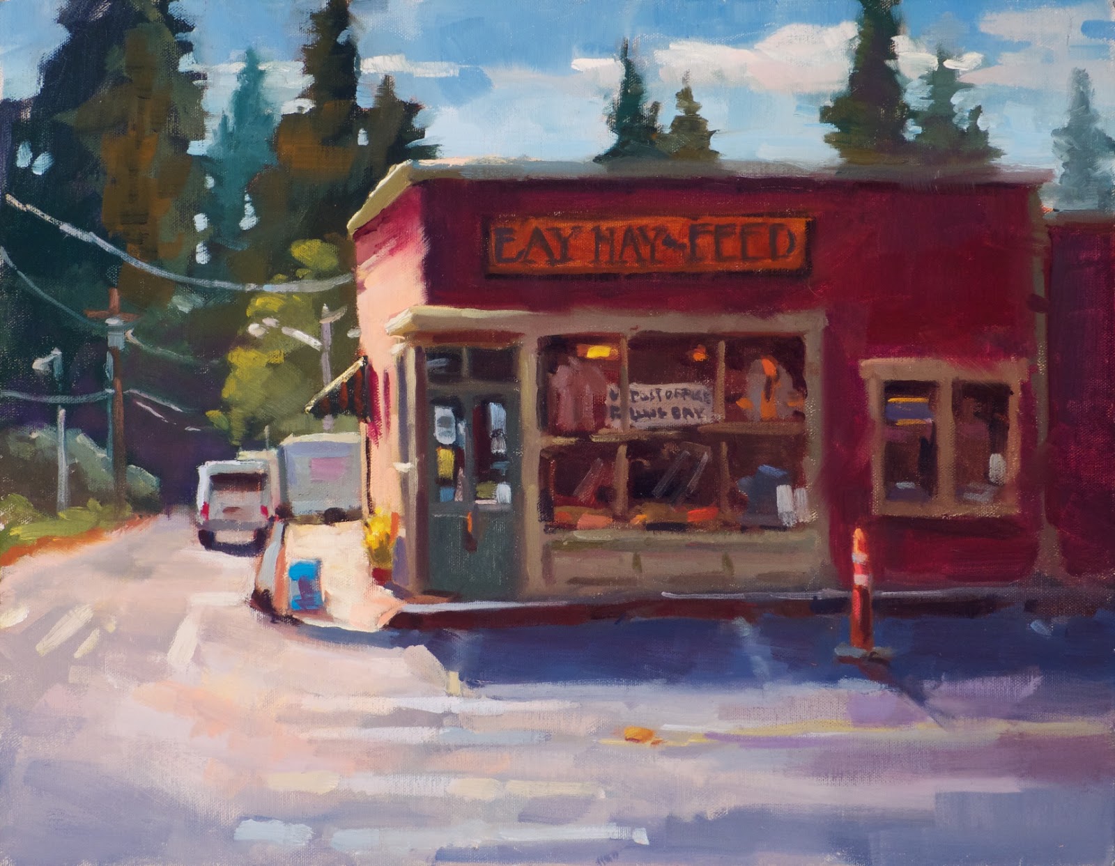
.....at the Port Townsend shipyards gives me a good opportunity to talk about some things.  I showed this to some people and mentioned I was dissatisfied with it and they told me I was crazy....again.

First let me point out some stuff.  This is a Sharpie with tones of cool gray Copic markers added on toned card stock.  The gouache washes were put in last.  The gouache can add sparkle, help to focus the viewer. and soften some of the darker marks where I might want a easier edge.

In general, I like the drawing.  Shapes and lines are repeated, such as the verticals in the various posts and masts and the angle of the large cloud is mirrored in the bottom line coming forward.  Horizontals in the clouds and white marks on the pavement repeat each other.  I like the placement of the boat, the tendency for detail to decrease as the drawing goes out and back from the boat, and for some of the 'I made it up' marks such as the two perspective lines that come out toward the viewer.....most all that is intuitive.  But there is something that bothers me.

I think it's the difference between visual accuracy and intuitive expression.  Sitting there I had the feeling of more looming immensity and power than I got down on paper.  There was a dimensionality that got lost and buried in my need for accuracy.

Don't get me wrong, accuracy of dimensions and relationships are important but sometimes a slight exaggeration is necessary to convey the 'feeling' of what we are painting or drawing.

This brings to mind Ron Lukas whose work I've been posting on FB and here for a bit.  No matter what I saw him draw or paint, there was always a sense of what I call 'dignity' in his work.  Everything was slightly and artistically altered to make that happen.  I asked him about it several times and he would look at me as if I were bizzaro....again.  Perhaps it was something unintentional that was just him....but I don't think so.  I think it was how he intuitively felt about things and he conveyed it through his drawing, his color selection and orchestration of values.  Others who are reading this and know his work would agree, I think, but many artists have done similar things.  Just look at the paintings and the photos of the subjects of Frank Benson....one of my heroes.

OK.  After all that I want to announce a new workshop, Drawing with Valued Markers, Level II, to be held May 20th, 2015.  It will be on the Winslow Art Center schedule sometime this week but wanted to give you an early 'heads up'.  It is a one day workshop sketching in the field (or coffee house) in which we will play around with gouache on toned paper, white markers and the usual variety of toned markers.  It really gets into the 'painting with markers' concepts.  More later.

Thanks for looking.  Have yourself a fine day.


Saturday, April 25, 2015

Morning Sketches


I needed stimulants.....

....so headed for the kitchen and the ground coffee.  Coming down the stairs this scene hit me.  At least something like it hit me because I'm sure my visual memory and the few notes on a piece of paper are off...but you might get the feeling of what it was.   Like most sunrises, it didn't last more than two or three minutes.  The photo I snapped was worthless for painting so I ignored it.

That bluish stripe was really there but my eyes couldn't see a lot unless I moved so that a tree blocked the sun enough that I could register the color.  Not likely a great sunrise painting but it was a fun sketch.  I think it has a hint of that Tommy Thompson flair about it.....unintentionally....but, hey, if I can get in the ball park.....

Tommy Thompson, Canadian Painter

Burnt Carmine, Transparent Red Oxide, Burnt Sienna,  Cad Orange, Yellow and Red, and the usual host of blues.  I'm hoping that when I look at this in a year I will know what I should have done, but then I'll wish I hadn't posted it.

Thanks for looking.


Tuesday, April 21, 2015

Ron Lukas Demo


Ron Lukas....

.....continues to strongly influence the way I paint.  Watching him pull together a painting was hypnotic because it seemed so effortless (it wasn't) and fast.  He could turn a large piece of canvas into visual candy in about 90 minutes or less.

A number of people have asked to see his work.  I have pics of several of his demos and this was the first one I saw him do at a workshop that I just lucked into.   I think this was where I first met Guido Frick (HERE), another awesome painter with a great spirit.  It was at a cabin/art center owned by Diane McClary (HERE).

Anyway, here are the pics in progression.  If you'd like to see another let me know.  I've heard he no longer paints in oil but is working in acrylic when he has the time.  He is still doing work for the movie industry.  Click on the images for a closer view.


Thanks for looking.  Back again soon.


Monday, April 20, 2015

Bay Hay, 12x16


Just up island....

......is an old structure that is a local landmark.  Post office, bakery, but mostly a plant and garden center with lots of stuff packed into its meandering spaces.  Cars and people and trucks and bicycles come and go all day picking up feed for the chickens, mail, coffee and pastry.  The orange cone is to protect the space for the mail truck.

It was surprising to me, with all that activity, how most of the time it looked just like this.  I couldn't predict if a vehicle might remain long enough to paint it.  I got a photo of a motorcycle and started to put it in but it just didn't fit somehow.  So you get Bay Hay & Feed inviting you to come in.

Painting wise, the problem was the moving sun.  The light on the left side lasted only about an hour so, after blocking in the shadowed side, I moved to resolve the light struck side as quickly as I could. Sky, clouds, trees, street all waited until I had the correct relationship between shadow and light and enough details whacked in just along that lit side.  Then, I did the rest.

Other than the incandescent lights showing inside, my favorite part is the crossing stripes and how they change color and their shapes move in and out with the soft edges.  Just to the left of the car is a purplish glow at the base of the trees.  There really was warmth there and I used it to draw the building hue into the rest of the painting.  Its also in the street and gently touched into the clouds.

Thanks for looking.  More soon.


Sunday, April 19, 2015

Spring On The Cle Elum, 12x12


It was Video Day, the day.....

.......Cathe Gill and I picked to do camera work for her upcoming video on using watercolor with pastel.  It will likely have the word 'ooze' in the title....due out in July.  Unfortunately, clouds, sun direction, wind and my patience did not cooperate.  I almost threw Cathe in the river....you know, she's smallish and I needed something to toss so it crossed my mind....fleetingly.

What else could we do but paint?  Sure enough, as soon as we were into it the weather cleared up.   This began as an overcast scene but lightened up soon enough that it was possible to pull it off without repainting the entire thing.

The challenge in this type of scene, at least for me, is to avoid 'organizing' it into equal spacing, similar heights and lots of tree 'fingers'  pointing to the sky.  Nature can pull it off without a hitch but what's out there sure doesn't always make a good painting.  Add to that our natural ability as humans to organize things, even unconsciously.   When I got it back in the studio I did have to gently guide it into something more pleasing but at least it wasn't much.

Stay in touch with Cathe's website if her video would be of interest to you.  I'll bug her to get something posted.  Look HERE.

Thanks for checking in.  I have more to post tomorrow.


Sunday, April 12, 2015

Everything But Frog, 12x16


Stumbling through the studio.....

......I literally fell into this painting from about a dozen years ago....(I really need to do some straightening up).  It didn't break or tear, which was fortunate, but it did make me think that doing a lily pad series this summer would be interesting, especially if I approached it in a more abstract way.   The ideas for that are beginning to flow.  Stay tuned.

A few years ago we were touring Monet's estate, walking around his ponds, gardens, house and studio.  It was a huge studio....more like a garage for buses.  He painted his lily pad series, immense  paintings that covered 12x20 foot walls, later in life when his eyesight was beginning to fail.  He would do those pieces by running (well, maybe he didn't actually 'run') out to the ponds, taking a quick look, and returning to the studio to add what he could to those canvases.....day after day, week after week.  I read somewhere that soon he was to lose his ability to even see color, still able to paint because he knew where the colors were supposed to be on his palette and what it took to mix new hues.

It was his initial 'concept' that kept it all going....plus a huge dose of experience and a dedicated talent.

So, taking a lesson from one of the Masters, I'm working on my ideas.  I'm also working on where to find some lily pad ponds.  Suggestions are welcome.

Thanks for looking.


Thursday, April 9, 2015

Godfrey Spit, 12x12


Composing to a square format....
......has it's challenges.  When it works it's a size that I find enjoyable....and I also enjoy the challenge of trying to find that illusive arrangement of shapes that can make it work.

This piece keeps me off-balance which is intriguing.  I had to change some elements in it to keep my eye moving.  Most of what was changed was in the foreground floating walkway.  In life it had more small uprights and the whole thing was backlit keeping this side fairly dark.  It became a visual fence that was hard to cross.....so out went some uprights and everything got lightened with some gray blue and warm tan bits.  My hope is that you can now get to the intersection of the sky, distant land and that boat perched on the dune.

Rob Weiss was painting just to my right out on the spit....or is it a bar?.... and his FB post about it is (HERE).  The photo doesn't do the piece justice but you can get an idea of what he painted.

Mitch Abala's recent blog post has some good thoughts on the continuum from ultra realism to total abstraction.  Since every successful piece of art is based ultimately on abstract concepts, it's good to have some idea where on that continuum you fall as either an artist or as a collector.  How much of either extreme can you tolerate before a piece no longer 'sings' to you?  Check out his thoughts (HERE).

Speaking of abstraction,  Cathleen Rehfield has a beautiful little sky piece posted on her blog (HERE)  I'm sure you will be able to place her somewhere along Mitch's continuum.  In her description she writes a line about Ultramarine Blue that cracked me up......'is Ultramarine blue such a ubiquitous blue that any ultramarine will do?'.    I don't know.  I think it was the rhythm and rhyme of it that affected me.....I went around for half a day with it playing in my head.  It's only one of my afflictions.

Ok.  Take yourself out and have some fun doing what you love.

Thanks for looking.