
Having once painted with 16 to 20 different oil colors on my palette and adhering to the belief that that was the best and only way to adequately mix color, for some reason I don't remember when or why I began to reduce the number of hues. Soon I was down to five and, for the last couple of years, down to three. Scott Christensen, Dawn Whitelaw, Tim Deibler, and James Richards, among others, influenced the move to a limited palette.
But does a limited palette mean limited choices? Once I would have said yes but now I'm convinced the initial idea of that meaning fewer choices is exactly the opposite. The false idea of limitation leads, in practice, to more creative and careful uses of what is available....maybe even more choice. Less is more and all that.
So I went to the paint store the other day and tried to find color samples that would confound and confuse those three colors.
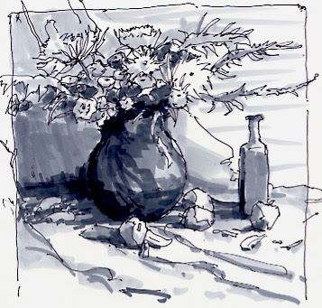
My 'palette' was a piece of grocery sack colored card stock coated with warm toned shellac, two coats on each side. It's what I often sketch on.
My colors are Titanium white, Cad Yellow Light, Pyrol Red, and Thalo blue (red shade). The first two I use regularly but the blue can be Ultramarine blue, Prussian blue, Thalo blue or Paynes gray depending on the subject, the light or my whimsey.
So I decided on a challenge. I went to the paint store and picked up samples that I thought might be fun. I brought home 21 colors to see if, using that short palette, I could match those paint chips. Here are the results:
 |
| The First Batch |
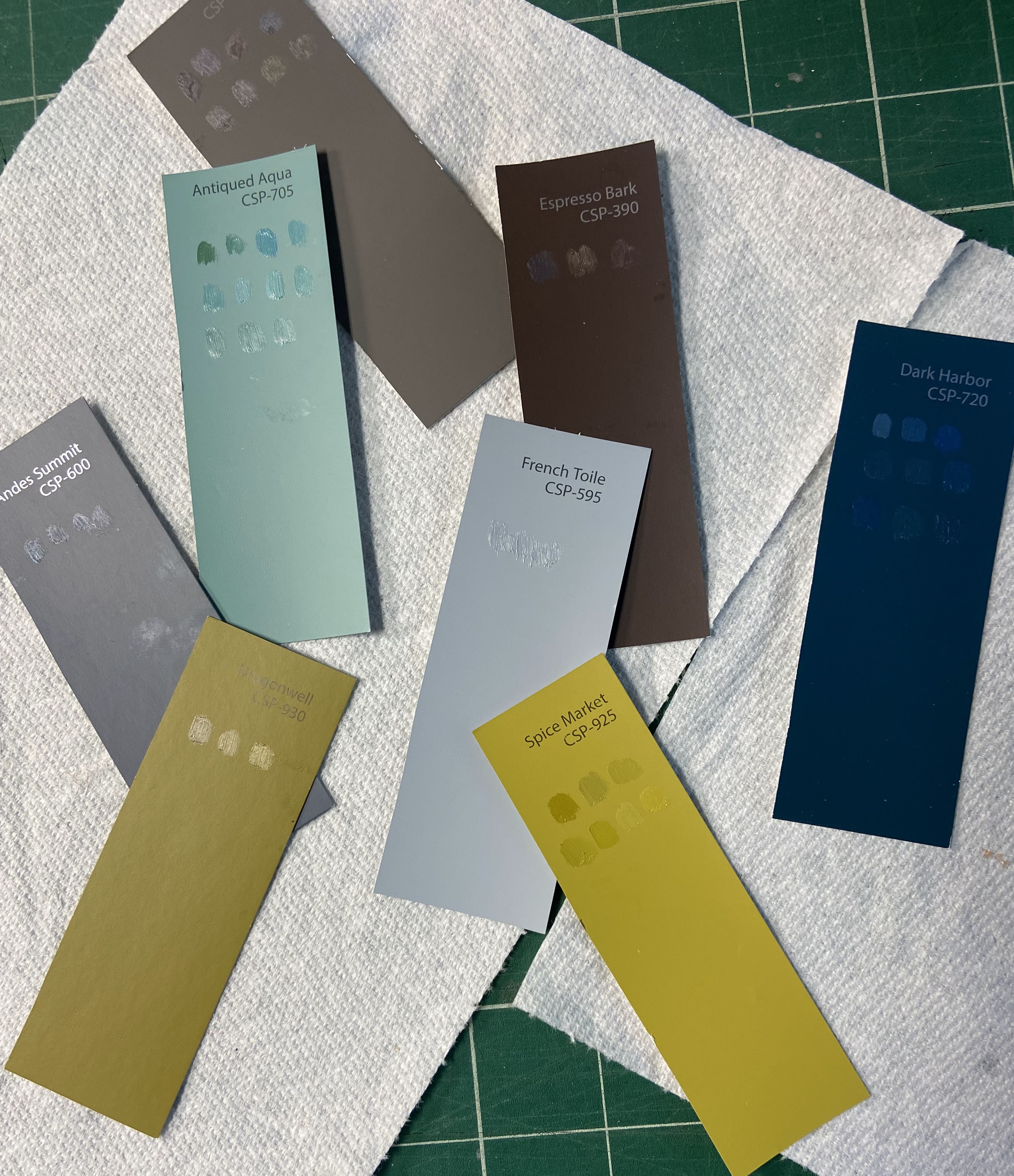 |
| The Second Batch |
Like when I go out painting, the first thing I did was to squeeze out the primaries and then mix the secondaries. On the pic of my paper palette above you can see the primaries, secondaries and my mixing attempts. I have tried it both ways when painting and having the mixed secondaries there always makes the final paintings go faster, plus they feel more interesting and colorful compared to mixing color as I go.
Perhaps that speaks to having a broader palette in the first place yet mixing all hues from the primaries lets the colors sit together so much better. It's like having a party where everyone likes each other in the first place ... Avoids so many squabbles and disagreements.
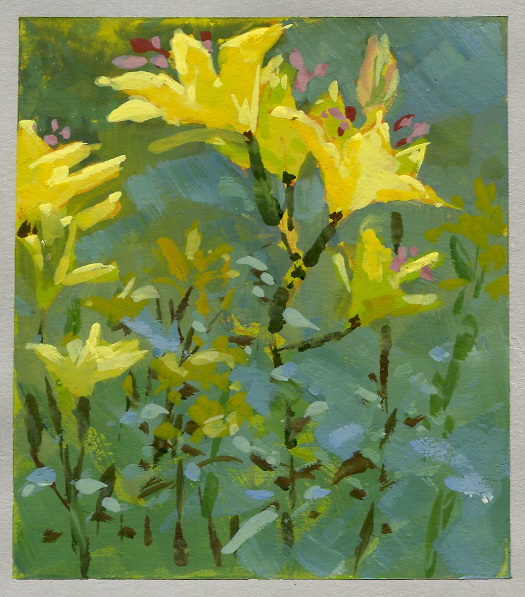
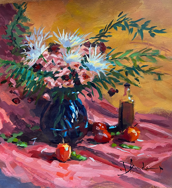
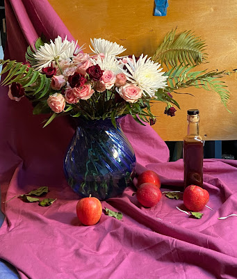
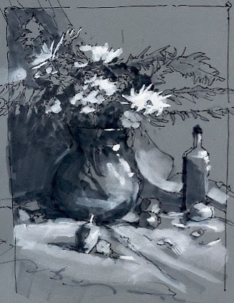
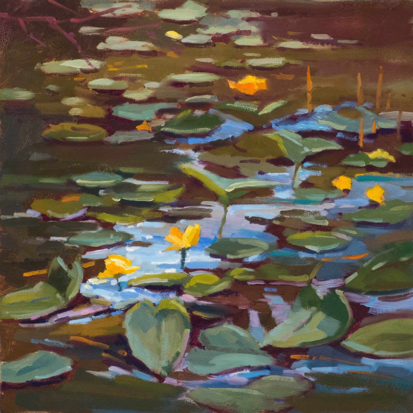
Thanks for being here. I'll be back with some samples of work I've done with only 3 colors...