Friday, December 11, 2009

The Sketcher, 16x20


Compared to getting a decent photo of this, the painting was easy. Gloss from the medium made all that dark red and black have a bunch of reflections which, even under polarized light and filters, wouldn't vanish completely. This shot isn't too bad but the actualo painting still works better.

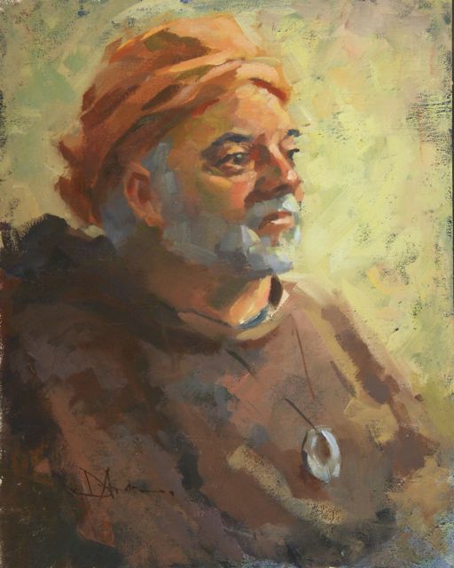
This will be the last limited palette no predraw painting I'll post for a while. I think I'm beginning to proselytize and I have some other ideas I want to try.

A friend and fantastic artist posed for our painting group. She usually works on a ModBook and set herself up to look like that was what she was drawing on. Dramatic lighting and the colors in her hair made this fun to paint. About 2 1/2 hours. This is the first of two paintings of her that day. The ease and speed of painting in this manner made two paintings possible...oops, there I go again.

A Good Day, 12x16


OK. Change of materials but, as in the previous paintings, no pre-drawing. This one was started by lightly blocking in the dark shapes and then honing them to a likeness. The hair, under the chin, dress, and background were gently placed with a Faber-Castell pencil and modified as needed for value and likeness. Somewhere toward the end of the drawing I began adding white for the lights and highlights. About an hour, I think, because I did two that day but gave away the second. I like the simplicity of materials and technique that encourages looking at shapes rather than line.

Monday, November 30, 2009

Red Vest, 16x20


Assuming you've read the previous blogs, try squinting at this one and follow the shadow down the back of his hat, under the brim, down his hair and under his collar and sleeve. That's what I blocked in with a warm neutral color. I added alizarin crimson to this palette because of the reds in the jacket and hat.....so, five hues, flat brushes and a little Galkyd Lite mixed with Gamsol for medium. Again, no pre-drawing; all the 'drawing' happened as the painting progressed. About three hours. I'll post one more portrait painting done like this and then perhaps a conte also with no 'predrawing'.

Brian, 16x20


The limited four color palette and no predrawing method was working so well I decided to try it with a portrait. I massed in the dark of his sweatshirt and the shadows on his face and hat. Since I then knew what was dark and what was light I was able to concentrate on color and draftsmanship for the rest of the painting. There was freedom in not having the lines of a drawing on the canvas. I felt unconstrained and could move paint wherever it needed to go without having to 'maintain a likeness' that I had pre-established. No drawing actually ended up being better drawing, if you know what I mean. About 3 hours.

Roslyn Autumn, 12x14


Another quick marker study and the resulting painting. When I did the drawing I was only interested in the major differences between the light and the dark areas so I used just one value of marker. Once I had that, I used paint to loosely block in those large shapes in a neutral color before adding the actual color you see here. Once the major light/dark separations were made, all I had to do is add color in a value that was similar to the block-in. That's when painting becomes fun.

Grange Hall, 10x12


On a rainy day east of the Cascades (Hi, Cathe!) I ran outside during one of the semi-breaks in the weather and, after marker sketching a 3" study, painted under the back door of the van. Again, this is the limited palette mentioned in the last post....the only addition was two handwarmers, a fleece vest and a heavy jacket. I still froze.

Perhaps this limitation in hues helps 'set' the colors together in a pleasing way. Notice how the value study is just a general indication of relationships. The painting keeps that overall idea but isn't a slave to the concept.

Eagle Harbor


I've been having a great time lately...with some time out to entertain the flu...painting with a limited palette and not doing any initial drawing. I like not drawing and, instead, loosely blocking in the dark and/or shadow sections with the same hue that changes with the type of subject. It seems to enhance the formation of large shapes early in the painting process. In this piece I used a reddish underpainting over everything but the sky and background. You can see it peeking through in the large tree and rocks.

This is the same (or similar) palette I used for the August postings: Turkey, burnt, or raw umber (yes, there actually is a 'turkey umber' and it's not what we did to the bird on Thanksgiving), cad yel light or deep, cad red light, cobalt blue ... sometimes Pthalo blue...sometimes a different red depending on the situation. I'll explain later.

Over the next few days I'll post a few more of the pieces done this way, including portraits.

Thursday, November 5, 2009

Filling Markers


OK, marker fans. You've been asking for this info....

I use three different brands of markers, Touch, Prismacolor and Copic, and have been successful in refilling them all. At first I didn't see the value in refilling, but after I counted up the number of markers hanging around the studio it made economic sense.....and especially after I ran out of marker juice during a demonstration.

All you need is the ink and refilling needles. Both Copic and Letraset sell the ink. I went to iCopic for my supplies and was able to refill every make of marker. For about $5, a bottle will refill a marker 5 t0 10 times, which is both cheaper and more convenient. They recommend getting a bottle of clear blender to clean up the needle, but since it's only ethyl alcohol (enthanol) I would think most any alcohol would work.

It's very easy. Connect the needle to the bottle of refill ink, gently thread it down the side of the marker tip and gently squeeze a few times. Let it rest a bit to distribute the ink and you've got a new marker. Disconnect the tip, rinse with alcohol, seal everything up and go draw.

In my opinion these are the ups and downs of the different brands: Prismacolor: easy to find, the tip has three edges for differing lines, they have a tendency to roll and the caps are a bit of trouble. Touch: seem to hold a lot of ink, not as easy to find. Copic: replaceable tips, different size markers with larger tips, easy to pop tips in and out, seem to be less 'toxic' smelling, harder to find, expensive. Letraset I haven't tried.

Wednesday, October 7, 2009

Gloria


Two drawings from last Thursday's open session, a 15 and a 20 minute......white charcoal pencil with willow charcoal on toned paper, approximately 20 x 24.

Sunday, September 27, 2009

Camden Hero, 6x9


A quickie for you marker drawers that like the toned paper. The brilliance of the sun on this statue made it an easy draw... which was good because I only had a few minutes before I was supposed to be at the Smiling Cow. Camden was hopping because it was the weekend of the windjammers. The harbor was full of those tall masted sailing ships which brought a sense of what the area must have looked like when wind and water powered the world....about the time of this Union soldier.

North Rustico Study, 7x10


Here is the marker study for the previous post. Although I liked the overlapping buildings and the bicycle on the roof, I felt there was something static about this drawing so I changed my position for the painting from high on a rock breakwater to the beach. If there was a do-over painting I think I'd combine parts of both for a finished piece. Perhaps I will....but there is so much else to paint....

"Give most of your attention to the four to seven largest pieces of value in your painting. If these few large hunks are not the most distinguished shapes you can make, your picture will fail." Frank Webb

Wednesday, September 23, 2009

North Rustico, 11x14


It must be the nature of islands that there are constantly new surprises just around the corner. Driving along the pavement came to an end but the road continued onto the beach....when the tide was out. I actually don't know if this was Rustico, South Rustico or North Rustico as I couldn't figure out the distinctions......no matter. I parked on the beach.

I hope you can see that it was the dock I was painting with the shore sand serving as an excuse for more color. The beaches on PEI are red, almost more red than is realistically paintable. (The place down the road had great haddock.)

Diana Shyne, a fine artist, was the impetus to get us to Anne of Green Gables land. She is a long time friend and we have painted together frequently and studied under some of the same people. If you get a chance to take one of her workshops, do so.

Sunday, September 20, 2009

Eastler Cabin, 6 1/2 x 9 1/2

Heading up the Maine coast to Prince Edward Island, and again on the way back, we stayed in this cabin that has been in the family of a friend since 1946. A peaceful lakeside place on twenty acres just a few miles from the coast. No shower. Had to go swimming to clean up. Ahhhhh.

You marker fans can pick out the three values pretty easily here. Imagine how I had to subdue the dark forested background in order for the cabin to stand out. It's easier if you follow the first 'rule' and quickly separate the dark from the light before going on to darker values. The same for painting.....use middle values to make a statement about the light and then, like a sculptor, carve out the painting with the darker and lighter tones.

Abandoned Farm


At first it was the color of the house peeking through the trees. Then I noticed the light patterns surrounding it. I finally became sold when I noticed the grayed magenta of the background trees.

I tried to make the acrylic look more like oil by painting thicker and softening some edges.

While on PEI we met Richard Vickerson, an accomplished artist in the Andrew Wyeth vein. We first ran into his works just after visiting the Wyeth museum in Rockland, ME, because they were in a gallery across the street. The online pictures of his work don't do him justice. While his style is about as far from my own as you can get, I found his strong abstract patterns and delicate use of color and value mesmerizing....and he's self taught.

Winter's Heat, 14x14


In the old town of Victoria, PEI, were these two old barns right on the main street. I liked the color contrast going on between the yellow orange of the wood pile and the blue shadowed barns. It also helped that the local chocolate factory/espresso machine was across the street.

I like this piece for its color and energy in the brush strokes. The light was changing so quickly that this had to be painted fast. Why is it that the pieces that are painted more from intuition and empathy than thought seem to work the best? I call these 'grab and go' studies. Done again I would change the composition and include the red motorcycle that moved away about half way through. (Yes, the barn was leaning.)

Quiet New Glascow, 11x14


Only one day was rainy and overcast, hence the subdued values and color in this piece. The challenge for me here was how to balance and connect both the farmhouse and the rocks, either of which could have been the focus. I intended to make the house the spot of main interest and use the rocks as a balance, connected by the little slice of road and the power pole. My eye travels around the piece fairly easily, but does it work for you?

By the way, I reloaded the two previous paintings to better represent their value and color.

Friday, September 18, 2009

New Glascow River


Prince Edward Island was a surprise to me. I had expected an extension of the Maine coast and woodlands. Instead we found rolling hills, small well-to-do farms, and tree lined ravines.

This was my first painting and I think you can get a sense of the land from it. Even though it is a relatively small island there are several rivers of which this is one. The nuances of color don't come across in this photo. In the painting the colors are more intense with subtle differences such as a red hue across the water and in the clouds which barely show up here. I think the color comes somehow from the red sandstone that makes up the island.

Camden Kids

I wish I had taken the time on this trip to draw more people. Just a few lines and a bit of tone can suggest so much. These two were sitting on a stone wall overlooking a spillway. The cormorants sitting on the rock were waiting for a meal to show up. There is a visual triangle formed between her dark hair, the dark of the birds and the shadow accent of the rock that moves the eye around the work. Simple, quick and all it takes to put me back in that moment.

Monday, September 14, 2009

Morning Harbor


Greetings from Prince Edward Island! Boston to Camden, Maine to PEI....what a great trip. I brought acryics this time because the person I was painting with is allergic to solvents. Plein air acrylics present their own problems but the fast drying time is always a pleasure when packing for traveling.

This is a quick morning study of a boat that tends the mussel lines that hang in the harbor. I was trying to subdue and abstract the background so the focus was clearly on the boat. This would have been easier with oil and I may try to repaint this both larger and in oil later this month. I'll post more when I get back on Thursday.

Thursday, August 27, 2009

Harbor Evening 12x12


'Life' seems to continually intrude on my painting time. The days go by and I realize it has been a week since I touched a brush...maybe longer. Arrgh.

Yesterday, frustration overcame procrastination. It was 6:45 in the evening, the light was beginning to wane and I had to go paint or spend a sleepless night. So I grabbed my gear, drove several miles to this spot and began throwing on paint. Staring into the sun meant painting from intuition almost more than what I could see, yet I began liking what was happening. The brushwork had energy and spontaneity.

By 8:10 I was back home with this piece, proving to myself once again that plein aire painting doesn't have to be a big deal. Just get out and do it. I like it as a study that could perhaps go larger one day.

Thursday, August 6, 2009

Bob's Tepee


This 12x14 was also painted before breakfast one morning. I wanted to catch the light just as it first lit parts of the tepee. As soon as the light hit the right spots I placed them and continued with the rest of the painting. When light strikes a cone shape it does strange things and does them quickly. In only forty minutes it had traversed to the other side.

I almost didn't paint this as it is so much a western stereotype, the symbology tending to overcome the rest of the work. It looked like fun so I did it anyway. Perhaps it's fodder for a larger piece. I do like the repetition of cone shapes that the trees add.

Tuesday, August 4, 2009

Deanna's Sunflowers, 12x12


Here is another from the Bitterroot Valley....that I painted in my pajamas. I woke up and there it was in the morning light. I have another 'before breakfast' painting that I'll post tomorrow.

I'm finding it difficult to get the color/value balance in these paintings. After I finish here I will reload the last post to make it more accurate, I hope. Even in this one the colors are just a bit too intense...but you get the idea.

Monday, August 3, 2009

Bitterroot Morning


I got an hour free to go down and paint the Bitterroot River south of Missoula. Free from what, you ask? From helping my friend write his drawing book. I'll post something about it when it gets published.
This image will likely have to be reloaded once I'm home as the colors/values appear incorrrect on his computer. We'll see.
Simple palette. Cobalt blue, Cad red med, Cad Yel Med, Cad Yel Light and Raw Umber. It makes for quick color cohesive paintings, even if it lacks some of the vibrancy of a fuller range of colors.

Monday, June 22, 2009

Golf Club Project


It's been busy around here. Graduation, relatives, sickness...and this project. Finally the drawings for the country club are finished and I can move on to 'real art'. Well, at least the art that I find more enjoyable, although this was a fun challenge.

I used markers on toned paper, gouache, one oil painting and here are some samples. There were ten pieces in all and double that number of preparatory drawings. I found a number of challenges. The drawings had to be larger in size than I usually do and everything had to be 'out of my head', even though I did have some reference photos. The photos only served for a few minutes of the initial sketch in and after that were no help. If there is a 'next time', and it looks as if there will, the process I'll use will be different.

Tomorrow it's off to Montana and oil painting in the great outdoors. I'll post again when I get back....about two weeks.

Keep drawing. Keep painting. Keep laughing.

Friday, May 29, 2009

Landscape Drawing


I've been hired to do the drawings for an extensive remodel, landscape and building facade, of a country club. This is a fun, but daunting, task. Here are two drawings I did yesterday to help get my head around the project.

The upper one is of the approach to what is a pretty ho-hum building. My favorite part of this drawing is the car.

The second is of some signage I was using for inspiration. I hadn't done a landscape piece on toned paper before.....people and still life only. I think it is just like painting a landscape in that you've got to simplify and then simplify some more to keep the detail from taking over so much that the major shapes get lost. I'm going to do some more of these and see if I can get better.

Saturday, May 16, 2009

Landscape Workshop


Today was the first outdoor painting workshop of the season and it was a beautiful day. That's 'D' in the front doing not only his first outdoor painting, but his first painting period. That takes courage. If painting indoors is like keeping ten plates spinning, outside its sixteen.

'V', above, is working on the first one of the day and she was hitting right on. 'T' was just getting in the large shapes of the first of six. A productive day. Even I had fun, but I pretty much bombed on my demos....not bad, but not great. I need to get out and paint more. It's amazing how quickly we can lose that facility of seeing.

Thursday, May 7, 2009

'The Drawing Session'


Here is another painting, 18x24, done at our weekly session. It's my friend, Cliff, who is a very talented artist, both fine and graphic. Look closely. Click on the image to enlarge it. Find the hidden image which will show you that this was painted over a different painting.

The photo is not as representative of the painting as I would want, but it still gets the idea across. I like the expression on his face and the slight leaning forward as someone would be doing while drawing.

Monday, May 4, 2009

'Bob'


Bob--16x20
I've been so busy with the book, painting the house, cleaning the studio and whatever that there hasn't been much painting time. Bob was the model at our painting group a few weeks ago. I like models that are animated while they are posing; it gives them life. Bob is a talker, but his stories are terrific. So much so that I think I only spent 2 hours on this painting....the other hour went to breaks and listening to his tales. I hope his spirit comes through in the work.

Tuesday, April 28, 2009

Waiting for 'Action'


Here is another sketch from the movie set. During four hours of mostly waiting, I had plenty of time to find willing (unwilling?) subjects. I think this was just before the hot tub scene....that sounds more interesting than it really was.

Sunday, April 26, 2009

On the Movie Set


My wife has a role in a movie....it's a lark. You've heard before that movie making is 'hurry up and wait'....it's true. I came as an extra but ended up drawing most of the time so I thought I'd share two of them. These are just fun to do. The lines prior to adding the tone are pretty simple. It's the values that bring out the form.

Saturday, April 25, 2009

Ferry Waiting


Just missing the ferry that Monday was frustrating....but once over my frustration it bacame an opportunity to draw for twenty minutes. This looks more complicated than it is. The illustrations in my book, Value Sketching with Markers, show you how simple a drawing can be before you add values. The values create form and give a sense of solidity. I still find it amazing and a great way to 'paint' without all the fuss. Just a few pens and some paper.

Friday, April 24, 2009

Morning at the Dock


A week ago, after dropping someone to catch the early morning ferry, I grabbed a cup of coffee and wandered down by the harbor. The sun was backlighting the ferry repair yard and the resting boats. If I had had time, it would have made a good painting. As it was, I settled for a quick drawing in which I tried to capture that lighting effect.

Because the 30% marker wasn't quite dark enough to make the buildings and trees on the horizon dark enough, I went over it again and think I got what I wanted.

Thursday, April 23, 2009

Marker to Monotype Followup


As a followup to the Marker to Monotype workshop demo:

I've included the drawing and painting done in the mountains last October. Compare orginal drawing, subsequent painting and monotype (from the last blog entry), and note that each is a different expression of the same scene. Thought you might find it interesting.

That day in the Cascades was one that is hard to forget. Not only was I painting with one of my best friends, but a weather change came over the mountains looking like one of those 'just before the end of the world' scenes we see in the movies. I've never seen so many different cloud formations boiling over the peaks. If God had spoken at that moment it would have fit right in.

Marker to Monotype


On Sunday was the Marker to Monotype Workshop. Participants turned their marker value drawings into prints.

The prints shown here are demos from that workshop. The still life is loosely taken from the demo drawing of the day before (see previous entry). I don't call it a good print, but it does make the point of how to reinterpret drawings.

The bottom landscape print is better, also taken from a marker drawing I did on location in the Cascade Mountains last Fall. The drawing preceeded a painting which is now framed and in a gallery.

As usual, I learned a lot from the people taking the workshop. It's so interesting to me how the same materials in different hands can yield such differing and unique results from every person. Drawings from the previous day and other marker workshops were turned into new artistic expressions. I was exhausted yet very gratified.

Marker Workshop Outdoors


In the afternoon we drove to a park where I did another demo sitting outdoors on the beach. Also, here is a photo of some of the folks enjoying themselves on a sunny Saturday. I had a great time.

Drawing or painting outdoors always presents its own difficulties. Changing tides, moving sun and shadows, wind, bugs.....they all contribute their share to make the experience exhilarating when it works, and frustrating when it doesn't. Despite all that, everyone did remarkably well.