 |
| The First Batch |
Wednesday, August 17, 2022
So What Can You Do With 3 Colors?
Monday, April 25, 2022
'Gouache on the Fly' Demos
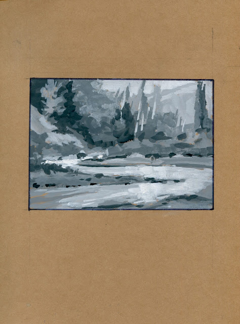
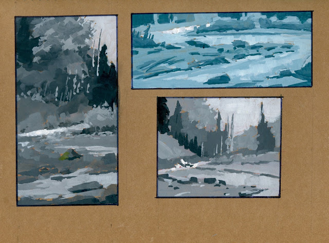
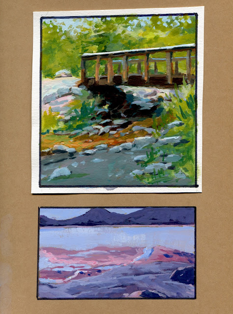
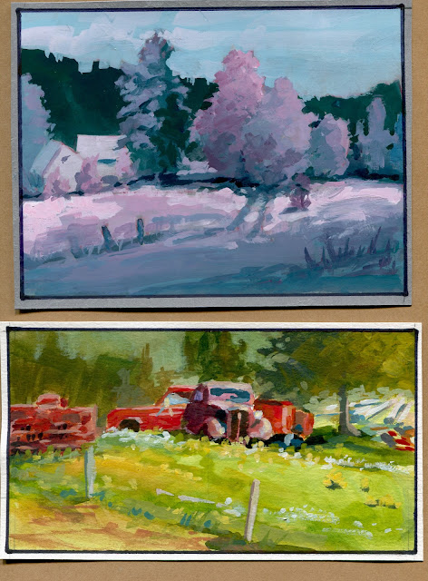
...Gouache on the Fly, my course in using watercolor instead of gouache to fill a very portable sketchbook. True, we also used white gouache and a little black, but most of the paintings were done using tubed watercolor like it was oil paint. We had a great time exploring this approach and here are the demos I did for those in the class but I thought you might enjoy them also. This is my third sketchbook done this way and I'm still enjoying the processs. Below are full page (8.5x11 inch) scans that begin in value studies and move on to full color.
The top one of the bridge is on a piece of watercolor paper; the bottom one is right on the sketchbook paper and is a value study done in a warm and cool color but not representative of the color in the scene, just the values.
Tuesday, March 22, 2022
One Sketchbook, Fifty Paintings
A Few From my 'Gouache on the Fly'....
....sketchbook. The Class begins on March 28th, 2022 through the Winslow Art Center (WAC click here) A simple, quick, easily transportable, and inexpensive way to sketch your artistic ideas. Come join us!
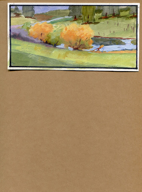
Here are a few more sketches, all plein air....
Thursday, March 17, 2022
"Gouache on the Fly" Course at Winslow Art Center
I have painted in gouache for.....
.....many years, decades actually, but on and off. It is a marvelous medium, very forgiving and convenient. Compared to oil paint, some control is lost. It doesn't exactly dry in a value that's similar to the way you mixed it. It also goes matte, losing some of the color intensity from what it looks like in the liquid state. That sounds frustrating and it is....but it is compensated by its fast drying, allowing the ability to quickly make it lighter or darker and go right over the top. Sometimes it's important to accept something uncontrolled and new.
A few years ago I began a notebook of heavy weight card stock paper in several color tones as a foundation for sketching with gouache (gouache is basically watercolor with calcium carbonate added for opacity and body). With a small kit I could carry it around with me almost anywhere and do sketches quickly, close the notebook and walk away with dry paintings to use as a library, of sorts, of material for other paintings or personal exploration.
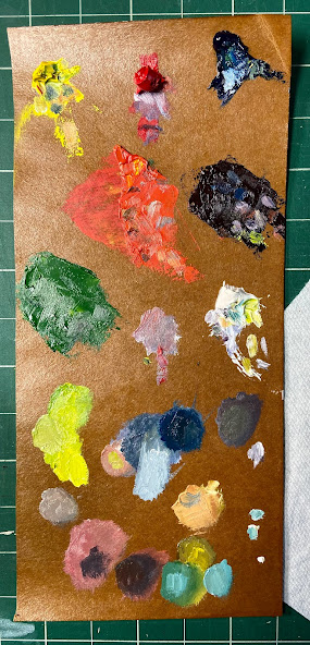
Missing for me was the transparency mixed with opacity effects so I began mixing in some watercolor. Soon the watercolor was the main medium but it was used with white gouache for the opacity part. Eventually I stopped carrying the colored gouache in favor of less expensive tubed watercolor. By using watercolor thinly in washes, but also thick like butter using straight paint or mixed with white gouache, I could realize the best of both worlds and that made it more fun and descriptive.
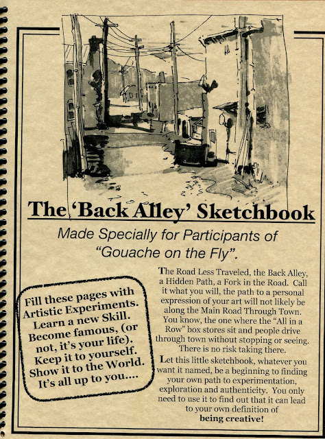
Beginning March 28th, 2022 I will be teaching a course in this technique through the Winslow Art Center online courses. The notebook I will supply for free once you sign up and the other supplies you will need are inexpensive. It makes for a great travel medium and its speed allows for many more studies than other mediums. Once dry, they can be covered with a variety of media that makes them very impervious to being harmed and can be framed without glass.
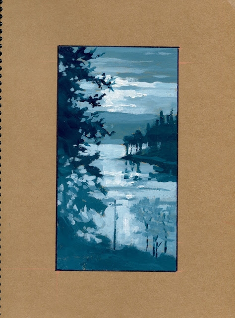
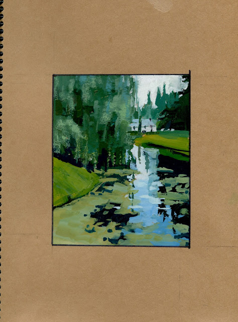
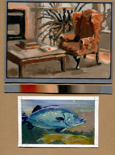
Here is a page from one of my sketchbooks showing a painting right on the notebook paper and another pasted in using a different paper:
Please join us. The class size is limited so come join us at the: Winslow Art Center .
Sunday, February 13, 2022
Marker Class Demos...the journey to a painting.
Currently, I have an on-line class in....
.... Drawing with Valued Markers, one of the best ways I know to sketch in the field and obtain the most information while exploring compositional ideas. Our course ends tomorrow and I'm interested in finding out if this group, like most of my class groups, thinks it has been helpful. The online experience has been different from teaching this in person so I'm looking to hear their feedback and ideas.
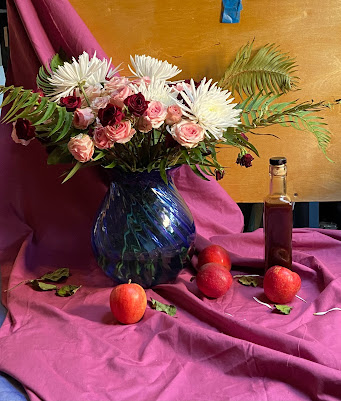
Here is the still life setup:
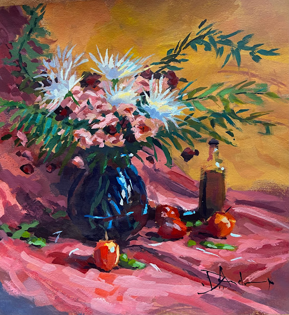
You can see that the lighting changed a bit between the time I took the photo of the setup and actually doing the painting in gouache.
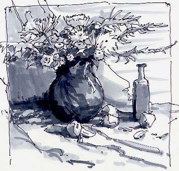
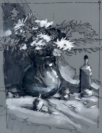
Here are two class demos. One is using 3 markers of differing values and a Sharpie pen, letting the white of the paper fill in another value, white or no value. The other is done on toned paper using the same values as the drawing on white paper but adding white gouache in varying thicknesses for the lighter notes.
Both of these versions give helpful ideas about composition, limited values and detail that are very helpful in the creation of paintings. The one I did is 11" square (image area) on paper that was toned like a kraft grocery bag.
Thanks for stopping by. If you keep coming I will likely start posting more often....and I have a studio of stuff that hasn't seen the light of day.
Oh yeah. My book is available again. Check the Pages above.
Keep Drawing!!

