Thursday, February 19, 2015

An Early Spring, 10x12


I don't remember where.....
.....I was originally headed.  Somewhere between the house and the car I saw this scene at the driveway turn around.  So much for what it was I was originally doing.

The linen that had once held yesterday's problem painting got re-purposed to do this one.  Rather than  canvas on board or stretchers, I've lately been taping pieces of loose cut linen or canvas or paper on plywood boards using packing tape.  I've seen Richard Schmid and John Crump doing the same thing and I liked the way they could just wipe off paint that got beyond the edge, recreating a sharp line around the piece.

This is what I did when in Italy last Fall and liked the way it worked.  As long as I had enough plywood boards to mount to, I could keep just ahead of the ones that were still drying before peeling off the tape.

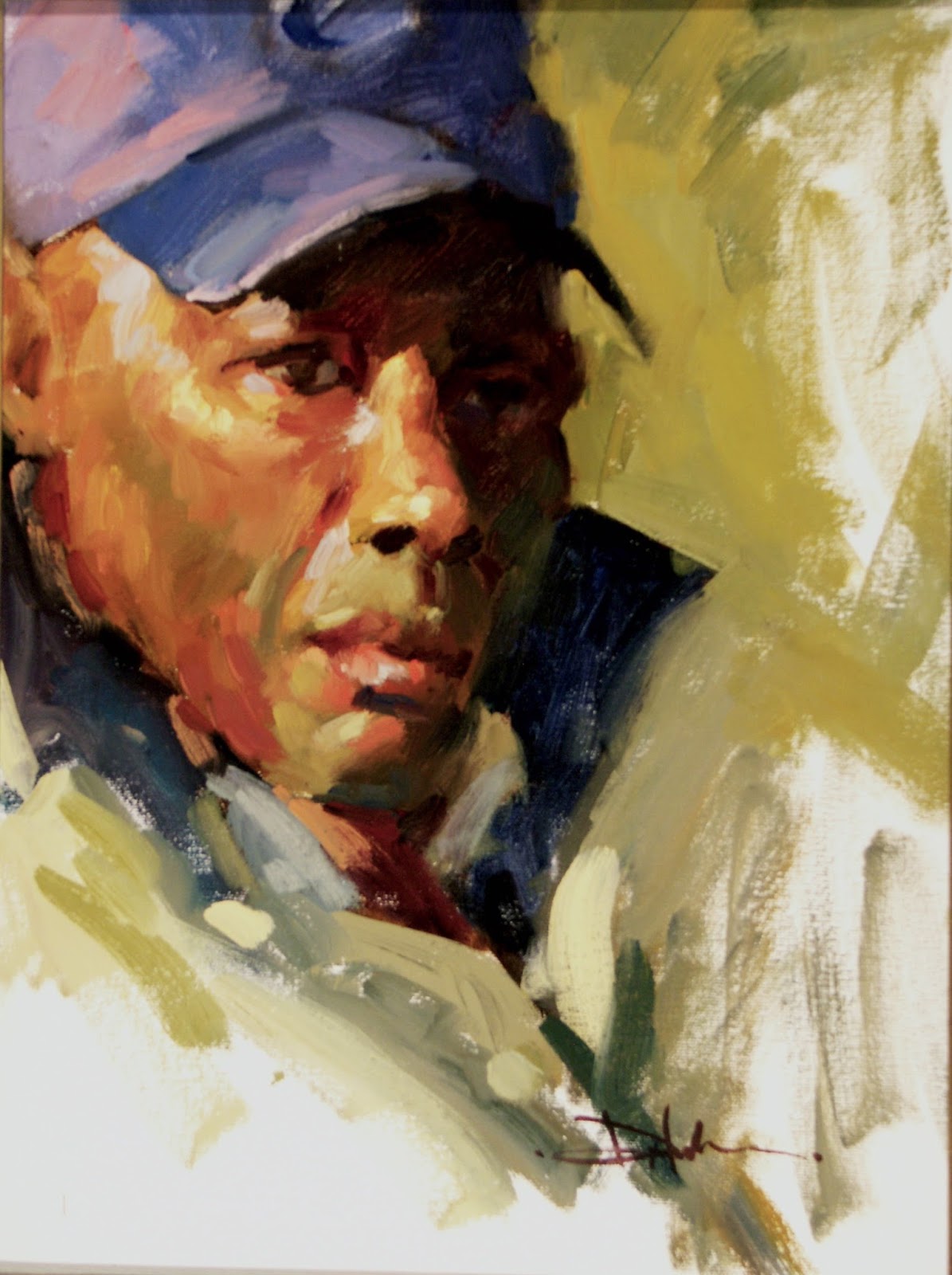
And I used it Tuesday when I painted a patio scene in Nancy's garden....wiped it off....and today when it was portrait Thursday....and I'll likely wipe those two also.

About wiping off (which I've been doing a lot of lately).   It's easy to think what gets wiped off is  to me a bad painting.  When I was learning, my friends and can tell you that was the case.  It was the swearing that gave me away....  I should have wiped off more, actually.

Now it's about a painting not getting where I need it to go.  It might be technically fine but if it isn't saying something new or adding to my visual vocabulary, there's no reason for it to stick around.  It isn't exciting me.

As much as I liked the scene this painting of early blooms was almost a wipe off.  It turned back from that when I saw the cool light on the shadowed side of the large tree and then saw it again in the blooming shrub.  Not only did that add to making the forms but it set up a warm cool vibration for the eye.

Don't forget the upcoming Oil Painting Class, the Portrait Workshop and the Marker Workshop through the Winslow Art Center (HERE).   ....and the Italy trip in October.

Thanks for visiting.  

Wednesday, February 18, 2015

Arroyo Footbridge, 9x12


Combining a plein air painting, a photo and my memory.....

.....brought this into existence.  It took all three; I wouldn't have attempted it from just a photo.

The painting source, done just around the corner in the same Sonoran arroyo, gave me the color notes.  The photo gave me the structural/shape information...but of course I changed some of that.  My memory brought forth the feeling of being there, the smells, the hot wind, the cool of the shade, the occasional passing kids and the fact that the photo didn't record the intensity of the glow under the bridge.  I kinda' like this one.

Plein air season is fast approaching.  Time to begin getting my gear ready.  What am I saying?....it's always ready!

Check out my schedule of classes and workshops in a previous post HERE.

Thanks for checking in..... and here is the painting I drew color ideas from:


Sunday, February 15, 2015

Unexpected Quiet, 10x12


Only a block or two....
.....from a major shopping mall you can find this hidden sanctuary of quiet.  I missed until Rob Weiss told me about it.

The day was overcast and drab and I almost fell into the 'there's nothing to paint, go home' trap....but I went ahead despite the cold and gloom, tramping the painting gear down the trail.  I was still unconvinced but no sooner had I sketched it in than the sun lightened the sky long enough to let me get the essence of what was there.

This one really is just 'big shapes' and 'do-dads'.

Speaking of Shapes and Doo-dads, this is a good time to answer the question I frequently get: "What's the difference between Notan and Marker Drawing?"  That question has been bothering you, right?  So here you go.... I'm doing this so you can sleep at night.

Notan on the Left, Valued Markers on the Right

So here are 2x3 inch drawings done in each method.  While these are done from the painting it's the same method, but larger,  I'd use out in the field before committing to canvas or paper.

Both are design tools, used to accomplish the purpose of studying our world.  The information they provide is slightly different and they build on each other.

Notan gives quick immediate feedback on the overall dark and light pattern in a subject and, since drawing and painting are really just illusions about the effects of light, this is absolutely necessary information.  Light and Shadow/Dark have to be kept separate or there is no illusion of form.  Notans  are fast to do and re-do as you modify your design concepts.

Valued Marker Drawing is almost as fast as Notan however, where Notan gives a broad graphic definition, valued markers move things up a notch toward rendition to include some detail.  Here the detail of the sun bleached curved trunk focuses a point of interest lost in the Notan study.  Other do-dads, such as reeds, water reflections and tree shapes are also part of the overall design and feeling.

The Valued Marker Drawing only adds one more value if you disregard the black ink from the drawing.  It keeps the Notan structure but adds in more of the transitional values.  It's here I can make decisions, within the structure, of how to guide the eye.

I do both, but decidedly more valued marker drawing because when I wander the world I'm not always interested in the graphic structure in black and white.  Notan gives me intellectual information.  Valued Markers also let me have some fun.  I recommend you try both.

Having said that, I teach a Marker Drawing workshop on March 21st.  Mitch Albala teaches a Notan workshop in the beginning of May.  Check them out at the Winslow Art Center website HERE.

By the way, Gabor Svagrik has a good blog post on making progress with your painting when you are feeling artistically blocked.  Great advice.  I wish I had written it.  Find it HERE.


Saturday, February 14, 2015

Classes, Workshops and Italy


Things come up so quickly.....

.....I'm lucky to make it to stuff it myself.....but I wanted to give a heads up on several events:

Painting to Your Next Level, Session 2, begins February 24th.  Class begins at 9:30 and runs until mid afternoon.  I leave at 1:30 but the studio is open for everyone in the class until 4:30.  Open to Oil, Gouache, Acrylic, Pastel....did I miss any?....and to all comers.

Portrait Intensive, March 6th, 7th and 8th.  Friday will be a demo and talk from 6:30 to 8:30.  I do this so participants will get full days worth of painting on Saturday and Sunday, which will run from 9:30 to 4:30.  Open to all media including good old paper and pencil.

Marker Workshop, March 21st, 9:30 to 4:00.  This is a fun course in how to use valued markers to quickly make sketches and studies.  Painless art instruction!  Beginners very welcome.  If you need supplies I can supply them at cost.


Italy Extravaganza.  Any time I go to Europe it's an extravaganza.....but in this case we will be drawing and painting the Italian landscape, cityscape, people or anything else that happens to get in our path.  The details are currently being hammered together for somewhere around the second week in October, 2015.   Pencil it in!

Information about all these classes, workshops or extravaganzas can be found by going to the website of the Winslow Art Center HERE.

Hope to see you in one of them, at least.

Thursday, February 12, 2015

A Thanks

'Grocery Run'
Wanted to post a 'Thank You'.....
.......to the recent flurry of people who have ordered my book 'Value Sketching With Markers'.  I think you'll enjoy what you pick up in the book, whether you are a sketcher or painter.  If you don't have one but are interested it's under the tab at the top of this page.

The drawing above I did yesterday coming home from grocery shopping.  It is just three values, white from the paper, plus a 30% and 60% grey marker.  I could have gone one more level darker in selected places but as it was it gave me the information I would need for a painting.  I contemplated accenting a few small bits around the larger house.  When in doubt, stop.

Here are two recent visual excursions.  These have all three marker values in them.  The point of drawing this way isn't to create a accurate rendition of what I see but to condense and move values around to simplify what is out there.  I makes for pleasing, more easily understood, artwork.

'Incoming Tide'


Still Life Study
When sketching outdoors I use 30%, 60% and 80% values of grey because there is generally so much light outside that the darker values get raised.  Indoors 30%, 70% and 90% seem to work best.....but it's your call.


Thursday, February 5, 2015

Foggy Friday, 11x14


'Foggy Friday' is a continuation.....
......of the previous post, 'Estuary'.

This is the morning painting when the fog was just barely beginning to lift.  Rob Weiss was close to a finish about the time I began so his painting got the full Friday fog feeling.  (Alliteration....couldn't help doing it....)

Rob's painting, a similar view, is on his Facebook page HERE.  Scroll down and find the painting (he also just posted it on his blog HERE)....and notice the great painting he did for Black History Month while there.  Outstanding.

In this one the light in the sky was beginning to show more color as things progressed, doing a little color mirroring of the driftwood. That wood actually took most of my time.  So many little color shapes to balance.....

By the way, here is a shot of what happens when you put three thickly painted wet portraits (two of which I liked) in the back of your van next to a rolled up sleeping bag.  That bag had sat back there for months without moving a bit....until that day.  Every time I took a corner it removed a little more paint.

And I didn't even get a monoprint out of it.


Wednesday, February 4, 2015

Estuary, 9x12


Friend and Dedicated Painter.....
.....Rob Weiss (his blog is HERE) gave me a call last Friday to say he was just down the street painting, so why not come too.  Within five minutes I was out the door.

The morning was pretty foggy but slowly clearing and Rob did a couple of terrific pieces from the same spot but looking different directions.  He had to leave about the time I was beginning this second one and the sun was breaking through the first three layers of clouds.  

There was something about the design of the water channel and the patterns in the sea grass that was intriguing.  As the sun broke through, the trees on that opposite bank began to contribute their glow and the painting fell together.

Now I want to do a larger one but maybe on a squarish panel.

I'll post the morning piece later.


Monday, February 2, 2015

A Bit About Drawing


After posting I got some Questions.....
....about this drawing.  Most were about detail, perspective, markers, perspective, using white gouache, perspective, drawing with a pen and perspective.  That about covers it, I think.

There was a theme.

So let's break it down.

When drawing something....anything.... I often try to find a 'yardstick' to work from.  In this case it was that lamppost in the foreground.


It was the first thing drawn on the page because I knew I could hang everything else off of it.  Knowing perspective can be handy when getting in trouble but most of the time I ignore it....like in this case.  Once I had the post visualized on the page and then drawn in I looked at the larger scene to find where other objects 'hung' off that pole.


The background is dimmed in this image but you can see where different parts intersect the lamppost, like here:


The ruler is established.  Then the lines were drawn in.  In this image I tried to erase everything but the original drawing but it became too time consuming to get them all.....  you can get the idea:


That was followed by 30% and 60% grey toned markers (see my book on Sketching With Valued Markers):


And finally 80% grey marker and white gouache diluted with water to different consistencies and, therefore, different values.  I had a bottle of drinking water and a small brush but no palette...so I used the palm of my hand.


Magic happened.

The whole thing is based on using that lamppost as a drawing 'ruler'.  The concept of perspective didn't enter my mind....but where things lined up with that lamppost plus relative vertical and horizontal distances did.

Using these ideas greatly simplifies what looks to be a complicated scene to get on paper.

I explored this 'ruler' idea in another blog about drawing in Italy from last September HERE.

If you are interested in perspective (it does come in handy) the best book I've found is from a man who used to live in Seattle named Norling.  It's only $6 at Amazon HERE and you might be able to find it used elsewhere.  It's been around a bit but does a good job of explaining things simply.

Thanks for asking the questions.