Saturday, March 28, 2015

Of Painting and Markers


Here is another.....
....from the arroyo series.  I didn't even know I had a series until uncovering this one lost in an old painting pile.  If you were to walk straight ahead under this little bridge you'd eventually come to the other two painting locations.  A lovely place with many memories.....

From that same town is one done late on a warm Spring evening sitting alone under a street light.  This is actually a repainting of the original plein air piece.  That one is owned by some friends:

Alamos Evening, 8x16

And for a change of pace.....

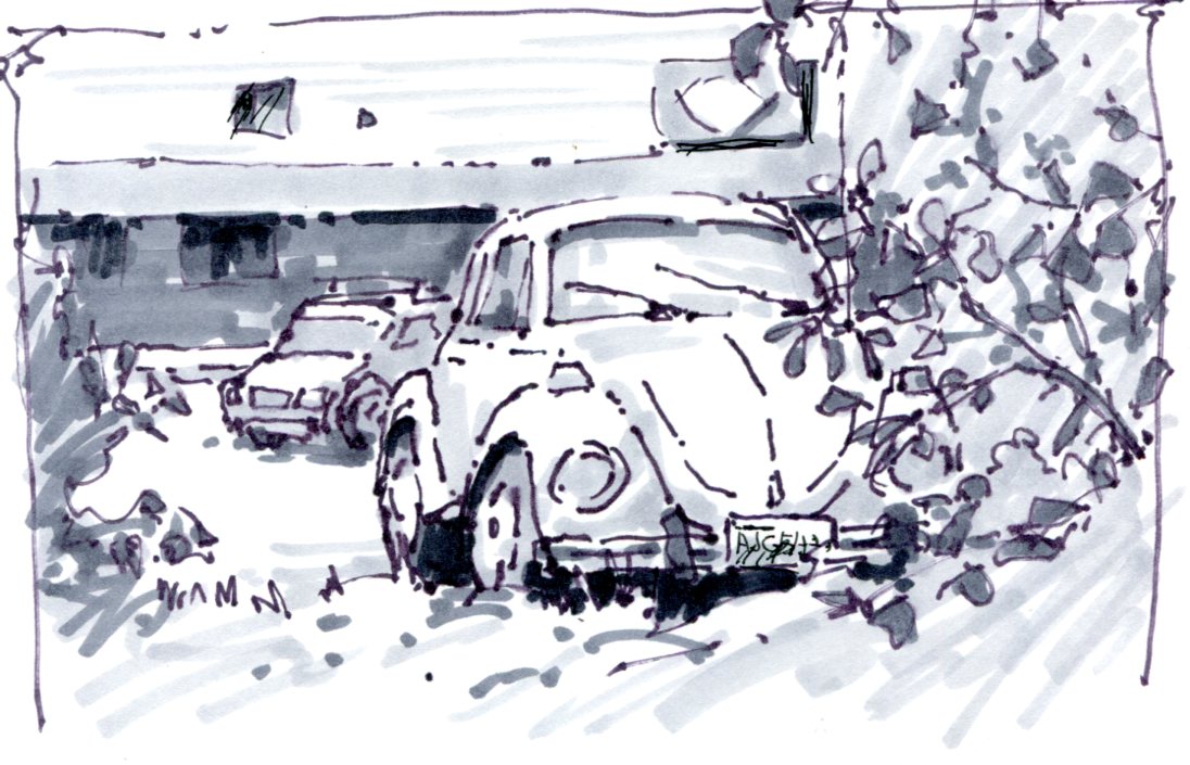
I was waiting with Noelle sitting in front of a Michael's and decided to drop in to look around.  They had some cool toned card stock in various sizes on sale.  Always on the look for better drawing instruments I stumbled on some white markers that work great.....and cheap.  I usually use either gouache or a Signo Uniball white pen for accents on toned paper, but these white markers looked enticing.

When I got home I made up some small 4.5 x 6.5 pocket sketchbooks for gouache, markers and whatever.  To try out my new toys I sat in our carport sketching the paint cans and tools cluttering things up from our current house project.  The white marks come from those Michael's markers.  Check them out.  I think they are only $1.99.

House Painting, abt 4x5

Small Sketchbooks and new white markers

Once again, Thanks For Looking and hanging around.

Sunday, March 22, 2015

Gone With The Wind


 Our informal Portrait Group.....
.......meets every Thursday at Studio 12 during the rainy months.  We drag all sorts of people in off the streets to pose for us.  This woman runs a boutique here on the island next to Roby King Gallery.

I've been doing quick ones on 9 x12 Canson paper using oils.  Works great but the paper does make the paint sticky after a few minutes and blending is impossible.  Cheap, though, and I don't blend all that much anyway.  I think they call it 'tiling' the paint.

I give myself 45 minutes to an hour to do one of these so I've been able to jamb in four before our session ends.  Good practice.  Here is another in Raw Umber, white and some Ultramarine Blue mixed in for the intense darks.


The face portion is three times the size of the colored one and you'd think, because it's easier to paint larger, that it would have come out better.  Oh well.  Tomorrow is another day.  (Wasn't that the last line after 3 1/2 hours of watching Gone With The Wind?)

And another exploration of face color from two weeks ago.  Her I used Quinacridone Red, Cad Yellow Light, and Prussian Blue....and one of Daniel Corey's favorite simple palettes.   His blog is HERE.

Stern looking....but this was about color....and I like that.


Thanks for looking.


Friday, March 20, 2015

Jane Wallis Marker Drawings


Jane Wallis.....
.....is someone I have painted portraits next to for years in our small group.  She, and her husband Mel, taught art at one of our local colleges but have left formal teaching to do their own thing.  Their website is HERE.

We were at the PAWA (Plein Air Painters of Washington) winter event together.  She had left out her little sketchbook and I opened it to find these wonderful marker drawings.  Off handedly she said, "Oh, those.  Yeah, I've done them for years."

I said "So why didn't you write a book?  These are great!  I'm impressed!"

"Well....(she's from Oklahoma so drawl that out a bit)....because you've already written one."

"Aw, shucks, you betcha'."  (I'm from Minnesota.)

So she let me photo some of them with my iPhone.  I think they are about 4x5 inches.  I haven't talked to her about them yet but they obviously seem like studies in advance of paintings which would explain the grid work.  I begin with a black ink pen.  It appears she uses a light marker and then sculpts in, over and around her initial marks to pull out the form with darker tones.


I find them very painterly expressions which allow for soft edges and lots of textural elements.


You can see those initial marks pretty easily in this one, especially behind the large tree.


Of course, her strong drawing skills show through in each of them.   Knowing that little flicks of light and dark marks can make the illusion of a group of diners sitting at tables takes a bit of know-how.


There is some paint on the upper corner of this one so the grid must be for transferring the drawing to canvas.  I think I'm going to have to make a trip over to their place to get the real low-down on all this.

When I marker draw I begin with a fine tipped felt pen because I'm fascinated by line and how lost I can get in the flow of it going on the paper.  It also provides extra detail for later.  Jane's go the other direction, emphasizing form with less delineation.  Her paintings are soft expressions of exuberant but closely related color and evoke a lot of feeling when I see them.  I've never seen any of these drawings done as paintings.

I'll be reporting back.  In the meantime you might find her technique of interest.

Thanks for looking.


Wednesday, March 18, 2015

March Demo, 18x21


Demos.....
.....I love doing them.  For a while I thought it was 'showing off' but realized that it never felt like that because I'm seldom satisfied with the results.  It feels like my energy and visual acuity levels go up when I've got a bunch of people expecting something from me....and I like to make people happy.

Yesterday.
I began with a ten or twelve minute marker drawing just to scope out the shapes of light and dark masses and get a composition.  It mimics, but doesn't attempt to accurately copy, what I'm looking at. And, while I'm at it, there is still a place left for my Marker sketching workshop on Saturday.  Go HERE for details.


Nancy seems to be my official photographer and took some photos of the process....about two hours.  For the painterly minded, I use mostly Rembrandt paints supplemented by Utrecht, Windsor and Newton and Gamblin where necessary.  You can see me using a large 'egbert' style brush during the blocking because I like the unpredictability of it.  The rest of the piece uses Silver Bristlon Flats in various sizes.  It was done on a masonite panel with three coats of Utrecht gesso applied with a roller and lightly sanded between coats.

Loosely sketching it in.
The 'egbert' establishing initial color and tone.


Competed blockin, moving to value and color adjustments.
Close to the end, just before the final adjustments and doodads.

Every time I think I am going to be more reserved in my color and looser in paint application, this kind of thing happens.  The first plein air painting I completed was at a week long workshop.  I spent the whole week working on it.  I knew I had gotten to the limit of my painting skills at that time.  The instructor, Ron Lukas, came around and, after staring at it a bit said, 'Well, you sure aren't afraid of color.' and walked away.  To this day I'm not sure if that was a compliment or a subtle suggestion.  Ron was like that.

Thanks for looking.  See you out and about.


Monday, March 16, 2015

Marker Sketching on Pi day


Marker Sketching....

.....simple to complex.  My Marker Workshop is this coming Saturday so I thought I'd get the juices flowing a bit.  There are two spots left if you can make it.  We always have a blast.  Don't worry about materials because for about $25 I can supply you with everything you need.  Find out more at the Winslow Art Center HERE.

Whether you draw something simple or more intricate, the magic of quickly creating the illusion of form on a blank page still happens.  In many ways the simpler forms are graphically more interesting plus much faster to create:

A simple form.


For those of you too far away to attend the workshop and watch a demo, here is a re-creation of how I did the 'Volks' sketch:

Beginning lines.  Got to start somewhere....

So how to begin?  I look for the simplest and most easily drawn part I can find that can also serve as a visual 'measuring stick'.  I didn't know how far to the right the roof line would go but was fairly confident about the vertical rear edge....so that came first.

The window fit itself in that space pretty well....but I looked carefully before committing to it.
Looking with care I noted how the shape of the window fit itself into the very first lines.  This is where the whole thing could have gone south on me....so I looked and thought it through several times before going ahead.

Rear wheel made it....whew.
As the drawing built itself up it became faster and easier to draw.  I still had to look carefully before putting in this rear wheel.  I imaged what it would be on the paper and placed it in, doing the very rear fender first.  This completed my 'yardstick' for the rest of the drawing and everything else could be more easily judged from that.

By lining things up vertically and horizontally with what I had down, the car could be finished.

It made sense to complete the car before the background or front tree was drawn.  Notice how I made several mistakes on the driver side of the windshield.  I wasn't too concerned because it was fairly hidden behind the tree.

Completed drawing before adding the marker tones.

Drawing complete.  I couldn't get all the marker tones erased but you can get the idea.

Now for the markers.  This is where magic happens.  I can't show you the steps in adding the values but suffice to say that I use a 30% gray marker to separate all light struck areas from those in shadow (or dark).  I go over everything with that 30%, leaving the white paper just where I want to maintain the lightest light struck areas.

So.  There you go.

Volks.....in situ.


If you work in markers I'd love to see your drawings.  Later this week I'll post some marker sketches of a friend that uses these tools in a different way.....and the drawings are beautiful.

Monday, March 2, 2015

Portrait Workshop, March 6,7,8th


This Message Made My Day.....
...........Darrell Anderson is my kinda instructor!!! I was just telling a friend how my portrait class with you provided me with strong technical concepts or approaches but more A MULTITUDE OF ONE LINERS THAT STUCK WITH ME TO THIS DAY! You I get as a person but better as an instructor! Have fun Darrell Anderson! "The beginning is the DIFFICULTY whereas the end just HAPPENS and will always be out of your control".... ME"

I try to teach in a way I'd like to be taught myself...but adapt it for each person's different style and skill level.  Admittedly it doesn't always happen just the way I'd like but after fifteen years of teaching art many of the instructional hiccups are worked out.

This coming weekend is your opportunity.  We cut off admissions for the portrait workshop on Wednesday.  Take a look and then contact the Winslow Art Center for more info: HERE.


What materials you choose are up to you.  Conte' with white charcoal pencil can make a beautifully expressive piece.


Gouache is simple to use and easily correctible and I love the way the colors work together.


 Watercolor either works....or not.  There doesn't seem to be an in-between but the luminosity of color is it's uniqueness.


And, of course, oils have the textural and sculptural qualities that make them so deeply expressive.  Here's another:


And, lastly, is simple paper and pencil.  I like it because it is a very direct and personal expression of both the artist and the subject.  


Unabashedly I'm trying to interest you in trying a weekend of portraiture.  This opportunity will come and go, and I likely won't be teaching another for at least a year.  I'd like you to come.

Contact the Winslow Art Center HERE for details.

Sunday, March 1, 2015

Three From This Week

PAWA......
....is not the hip way to say 'power'.....  but it is the organization Plein Air Painters of Washington who had their winter get-together last Saturday.  We eat, we schmooze and we paint from models and still life.  If you are in Washington and paint outdoors you should join.  They are nice people.

These are paintings I did that day, the model in the morning and, not knowing what else to do, the still life right behind me in the afternoon.  Each took about two hours.

I had fun with both.  With 'Trudy' it was the cool colors bouncing into the shadowed side of her face against the sparkles of warmth from the spotlight.  In the still life I played with the steep angle of view as the setup was almost directly under me.

PAWA Still life, 20x20

By the way, my Portrait Workshop is next weekend.  We already have people coming but have room for a few more if you can make it.  Contact the Winslow Art Center (HERE) for more info and to sign up.  I'll post about this again in a day or two.

Two days ago a good friend invited me over to paint a little still life she had set up.....at least that's what got communicated to me.  So, expecting a simple little arrangement of maybe a few apples and a vase or something, I went over.  I painted.....and I picked the backlit spot just to make it more difficult. 

I had to go back.  Not only was it a bit of a challenge but the flowers kept moving all over and doing some jazzed up blossoming.  There was even one that completely vanished.  I don't know where it went....into hiding.  Tulips and daffodils do that.  I had to name the painting 'Blossom Blizzard'.....what else?

Blossom Blizzard, 15x18