Tuesday, March 23, 2010

On Quitting Painting


In the last ten days I have decided to quit painting at least four times.  The paint isn't flowing, the drawings aren't working, color relationships are off, values are in the middle range....it all just seems clunky.

Most painters I talk to have periods like this one.  After years of these attacks of 'quitting for good' I've come to realize, however rotten I feel, that it's just part of the process.  Maybe tomorrow it will all be different and the brush will be a friend....maybe it won't.

Stay tuned.  I feel a breakthrough coming on....

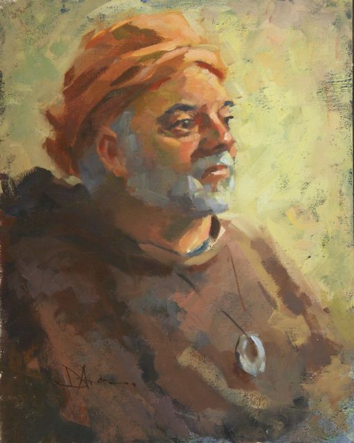
(This demo painting is from some months ago....just to put something on the blog.)

Tuesday, March 9, 2010

Island Morning, 24x24


While in the studio the other day I ran across a small study done about a year ago and, together with a marker sketch, redid the painting in a larger size.  Keeping with 'no predrawing' I quickly blocked it in with a grayish purple and just kept going.  That undertone wasn't bad for establishing a cool morning mood but I may paint it again with a warmer undertone just to see where it goes.  Simple shapes hopefully kept together. 

Wednesday, March 3, 2010

Demo Value Sketch and Color Comp


Before doing the class demo from the previous  blog I did a quick marker value study.  By exploring and simplifying the value arrangements in a quick sketch I was better able to tie some of the pieces together.  I think its like beginning a conversation with someone you don't know yet.  We found an understanding that let us continue. 
I then did this 4 1/4 by 4 3/4 color comp on some watercolor paper(the scan came out a bit dark).  I used a palette knife so the colors would stay fresh and unblended.  I remember being most interested in how to treat the background tones, keeping them related to the other parts.  Sometimes these comps are as appealing as the finished painting.

Tuesday, March 2, 2010

Marker Book


 I've gotten several inquiries about my book on sketching with markers.  Here's the skinny:

I'm in a rewrite of it to include some new chapters and new material (plus I'm out of stock so a good time to improve it...it's like writing software.  Always an upgrade).  It is currently 52 pages long but it looks like the new one will be in the sixty page area.  The graphic below is from last year so ignore the date....however I expect the new one will be out in early April.  Only a month away.

If you are following this blog, you'll know about it as soon as I have it in my hands.

Thanks for the interest.
 

Winter demo 20x24


So long since I've blogged...it has been a very busy six weeks.

This is the demo I did for my intermediate painting class.  After I was finished we critiqued it.  I made the changes we felt would improve the piece in about five minutes and they worked.  I moved the peak of the cloth from behind the green decanter so they didn't line up, better anchored the foremost plum to the table cloth and placed some highlights on the coffee pot.  Small additions, really, but they all helped the piece flow.   Thanks for the suggestions.

Notice how everything has a light and shadow side, from the still life as a whole to the combination of pot and bouquet and down to each flower....and each has to fit into the value of the area it's in.  The shadowed flowers, for example, have lighter and darker areas but they stay within the context of where they are placed in the overall arrangement.  It's the gestalt of the thing.

Tomorrow I'll post the value drawing and color comp I did prior to painting the demo.

Sunday, February 28, 2010

The Painting Crew


Two 'beginning' painters with their last pieces.  Beginning is in quotes because the work in this class was past what I would expect from new painters.


And a few painters from the intermediate class.  I had a great time teaching these two groups and their attentiveness was humbling.  While skills and experience varied, their desire to know more about the process was consistently high.....and we all know that desire and talent are the same thing.  (Thanks, Ron.)
More tomorrow.  I'm back after a busy six weeks.

Monday, January 25, 2010

Yellow Daisies, 24 x 24


A relatively quick still life painting done about a week ago, I tried to find any excuse to push concepts of warm and cool while keeping an overall sense of the original color.  Still life painting can be such a good exercise and I can eat the fruit afterward.


I don't think there is a painting I wouldn't change if I had it to do over again....but I usually screw it up if I try and 'fix' it after the fact.  About 3 1/2 hours.

Sunday, January 24, 2010

The Docent


I think his name is Paul and he leads tours at the Museum of Flight in south Seattle.  He has a droll sense of humor.  "How long did you work at Boeing?"  "About forty years.  I quit because it didn't seem like we were going to get along."

  And if you are new here or haven't gotten the idea, no predrawing with lines...just blocking in of major shapes and going for a likeness.

Friday, January 22, 2010

My Bugs Bunny Tie


Ok.  I admit it.  This is a blast to do.  I'd rather do this than eat....almost. 

I began at the head and then moved down, quickly establishing the shadowed side of the jacket and the drape of the tie.  Then back to the head to get a likeness and everything else fell into place.  Just two pencils, white and some sort of earth color, and an eraser.  Probably 75 minutes.  (I want this guy's tie....)

Thursday, January 21, 2010

Kate


Recently I heard Kathryn Stats talk about drawing in the subject before painting and I thought she summarized what I've been experiencing really well.  "What you gain in accuracy (by pre-drawing) you lose in rhythm and spontaneity."  That seems right to me....except by not drawing I've curiously been getting more accurate as well as keeping rhythm and shape.   (Check out Kathryn's paintings.  A true colorist.)

Kate took about an hour or a bit more perhaps.  Beats me.  I was busy being spontaneous and having fun.  No lines, no pre-drawing, no agony. 

Thursday, January 14, 2010

Remodelling


I'm taking time to remodel....but still had to throw in some art.  This is a digital painting from one of my 'critters' that I draw in moments of whimsy.   Should be back posting in about a week.  Keep drawing, keep painting, keep on.

Monday, January 4, 2010

Little People


I had to take a quick ferry today to deliver some materials and, lacking any other diversions, I drew. The son of a friend is in school for digital art (and will soon be published in ImagineFX, the magazine). I saw his sketchbook the other day and he had filled a page with the coolest small people drawings....so I wanted to see what I could do. I had a pen and a marker with me so for you marker drawers why not give this a try? The smallest figure is 1" and the largest is 2"....so this is only the top half of my sketchbook that you see. Pencil sketch a little and then ink in if you want. Just don't try and be too literal. Get the idea and large shapes down and then let the marker shading bring out the form. I only got a glimpse of each figure and drew from memory. It was fun. Thanks Cody, yours were much better.

Friday, December 11, 2009

The Sketcher, 16x20


Compared to getting a decent photo of this, the painting was easy. Gloss from the medium made all that dark red and black have a bunch of reflections which, even under polarized light and filters, wouldn't vanish completely. This shot isn't too bad but the actualo painting still works better.

This will be the last limited palette no predraw painting I'll post for a while. I think I'm beginning to proselytize and I have some other ideas I want to try.

A friend and fantastic artist posed for our painting group. She usually works on a ModBook and set herself up to look like that was what she was drawing on. Dramatic lighting and the colors in her hair made this fun to paint. About 2 1/2 hours. This is the first of two paintings of her that day. The ease and speed of painting in this manner made two paintings possible...oops, there I go again.

A Good Day, 12x16


OK. Change of materials but, as in the previous paintings, no pre-drawing. This one was started by lightly blocking in the dark shapes and then honing them to a likeness. The hair, under the chin, dress, and background were gently placed with a Faber-Castell pencil and modified as needed for value and likeness. Somewhere toward the end of the drawing I began adding white for the lights and highlights. About an hour, I think, because I did two that day but gave away the second. I like the simplicity of materials and technique that encourages looking at shapes rather than line.

Monday, November 30, 2009

Red Vest, 16x20


Assuming you've read the previous blogs, try squinting at this one and follow the shadow down the back of his hat, under the brim, down his hair and under his collar and sleeve. That's what I blocked in with a warm neutral color. I added alizarin crimson to this palette because of the reds in the jacket and hat.....so, five hues, flat brushes and a little Galkyd Lite mixed with Gamsol for medium. Again, no pre-drawing; all the 'drawing' happened as the painting progressed. About three hours. I'll post one more portrait painting done like this and then perhaps a conte also with no 'predrawing'.

Brian, 16x20


The limited four color palette and no predrawing method was working so well I decided to try it with a portrait. I massed in the dark of his sweatshirt and the shadows on his face and hat. Since I then knew what was dark and what was light I was able to concentrate on color and draftsmanship for the rest of the painting. There was freedom in not having the lines of a drawing on the canvas. I felt unconstrained and could move paint wherever it needed to go without having to 'maintain a likeness' that I had pre-established. No drawing actually ended up being better drawing, if you know what I mean. About 3 hours.

Roslyn Autumn, 12x14


Another quick marker study and the resulting painting. When I did the drawing I was only interested in the major differences between the light and the dark areas so I used just one value of marker. Once I had that, I used paint to loosely block in those large shapes in a neutral color before adding the actual color you see here. Once the major light/dark separations were made, all I had to do is add color in a value that was similar to the block-in. That's when painting becomes fun.

Grange Hall, 10x12


On a rainy day east of the Cascades (Hi, Cathe!) I ran outside during one of the semi-breaks in the weather and, after marker sketching a 3" study, painted under the back door of the van. Again, this is the limited palette mentioned in the last post....the only addition was two handwarmers, a fleece vest and a heavy jacket. I still froze.

Perhaps this limitation in hues helps 'set' the colors together in a pleasing way. Notice how the value study is just a general indication of relationships. The painting keeps that overall idea but isn't a slave to the concept.

Eagle Harbor


I've been having a great time lately...with some time out to entertain the flu...painting with a limited palette and not doing any initial drawing. I like not drawing and, instead, loosely blocking in the dark and/or shadow sections with the same hue that changes with the type of subject. It seems to enhance the formation of large shapes early in the painting process. In this piece I used a reddish underpainting over everything but the sky and background. You can see it peeking through in the large tree and rocks.

This is the same (or similar) palette I used for the August postings: Turkey, burnt, or raw umber (yes, there actually is a 'turkey umber' and it's not what we did to the bird on Thanksgiving), cad yel light or deep, cad red light, cobalt blue ... sometimes Pthalo blue...sometimes a different red depending on the situation. I'll explain later.

Over the next few days I'll post a few more of the pieces done this way, including portraits.

Thursday, November 5, 2009

Filling Markers


OK, marker fans. You've been asking for this info....

I use three different brands of markers, Touch, Prismacolor and Copic, and have been successful in refilling them all. At first I didn't see the value in refilling, but after I counted up the number of markers hanging around the studio it made economic sense.....and especially after I ran out of marker juice during a demonstration.

All you need is the ink and refilling needles. Both Copic and Letraset sell the ink. I went to iCopic for my supplies and was able to refill every make of marker. For about $5, a bottle will refill a marker 5 t0 10 times, which is both cheaper and more convenient. They recommend getting a bottle of clear blender to clean up the needle, but since it's only ethyl alcohol (enthanol) I would think most any alcohol would work.

It's very easy. Connect the needle to the bottle of refill ink, gently thread it down the side of the marker tip and gently squeeze a few times. Let it rest a bit to distribute the ink and you've got a new marker. Disconnect the tip, rinse with alcohol, seal everything up and go draw.

In my opinion these are the ups and downs of the different brands: Prismacolor: easy to find, the tip has three edges for differing lines, they have a tendency to roll and the caps are a bit of trouble. Touch: seem to hold a lot of ink, not as easy to find. Copic: replaceable tips, different size markers with larger tips, easy to pop tips in and out, seem to be less 'toxic' smelling, harder to find, expensive. Letraset I haven't tried.