Tuesday, December 31, 2013

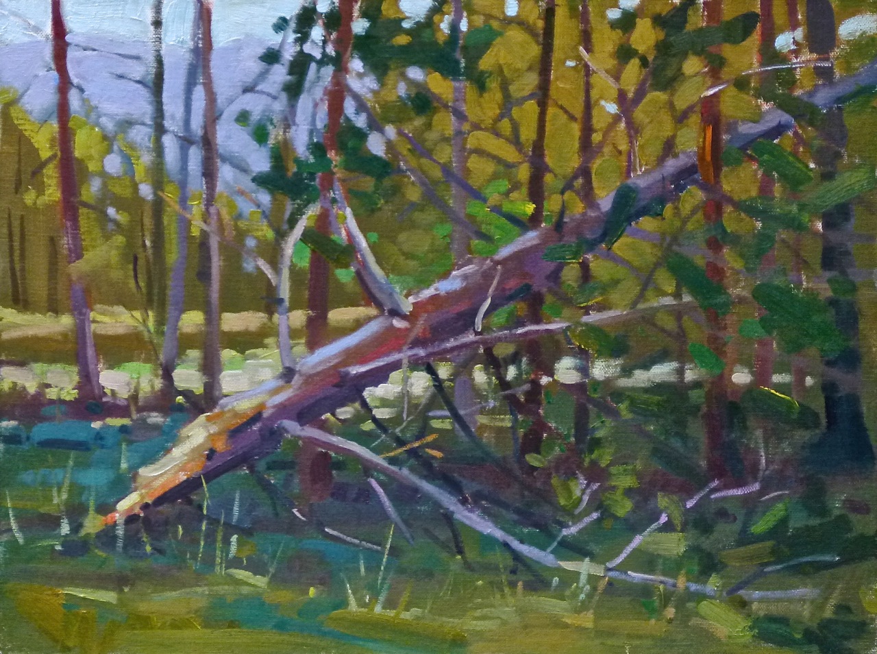
Neck and Neck, 10x12


"Time flies when you're having fun"......

From that I can only conclude that this past year I have been having a blast of a good time.  I'm in for that and more.  Good to have that feedback.  (Here's a study on it!)

Going through my end of the year 'toss 'em out' party I've been running across paintings I never got around to posting.  This is from one of my favorite places, Rockland, Maine, home of the Wyeth Museum, great fish and chips, thousands of boats and pretty nice people.  To be fair, I need to also throw in Camden, Rockport and about a hundred other little coastal towns.  Beautiful places.

This is the last post of 2013....  It was painted on a September evening in the company of Dan Corey.  He has a nice video on his blog of painting a snowman.  Worth a watch.


Tuesday, December 24, 2013

The Best to You, 16x20


Wherever you are....

....in this tiny world, may life be kind and generous to you and your family.  While we may seem far away from each other, a little money and a little time is all it would take for us to be face to face, greeting one another.  So I greet you now and hope the best and most peaceful fulfilling times for us all.


Friday, December 20, 2013

Emma, 18x24


Demonstration paintings....

...are surprisingly fun to do.  Painting 'Emma' was stressful, time and performance pressured and immersing, but because she was such a great first time model we both had a good time.  She was so helpful and attentive I'm giving her the painting.

I had volunteered to do a demo for my class thinking that, because it was mostly interpreting and painting landscapes from photographic reference, that they would like to see me do a landscape....or at least a still life.  But 'portrait' was the vote.

The people there took photos of the process and perhaps if some one of them could forward a few pics of the process I'll post them later.  In lieu of that, here is a closeup.  The demo took a bit more than two hours but that included model breaks and a bit of talking and explaining.

 
Painting classes begin again the last week of January at the Winslow Art Center.  I'll also be teaching a Marker Workshop in early February....plus some other courses.  Come join us....we have a lot of fun.


Friday, December 6, 2013

Emile Gruppe Is My Friend


We all have our 'turning points'....

....and one of mine was reading the book 'Blue and Yellow Don't Make Green'.  That was awhile ago but I think you can still find it on Amazon.  Worth your time.

Reading that book and its insights on color led me eventually to Emile Gruppe's books and paintings.  Most of his life he used a simple palette of colors consisting of a warm and cool version of each of the primaries....plus orange.  Seven colors.  Simple.

So for the last many years that's pretty much all I've used.  Occasionally I'll cycle in some different hues to see what they do or I'll squeeze out a color that might work for a particular painting...but the foundation is always that simple Gruppe palette.

With a warm and a cool of each primary it takes little effort to get nice color vibrations going.  In 'Island Farm' it is easy to find warm and cool yellows, reds and blues sitting next to each other and creating the kind of visual stimulus that keeps a viewing eye interested.

Of course it takes more than just color to make a good painting but fluid and related color mixing sure helps.

From that limited palette I can make most any hue but I do add some other colors just to play and see what they will do.  Currently I'm experimenting with Burnt Carmine and Kings Blue Light.  The Burnt Carmine is getting a workout but the KBL is pretty much sitting there and drying out.

Oh.  My palette?  Cadmium Lemon Yellow,  Cad Yellow Medium, Cad Red Light, Quinacridone Red, Burnt Sienna, Ultramarine Blue, Thalo Blue.  Occasional hues: Raw Umber, Ivory Black, Thalo Green, Yellow Ochre Light.

The Roby-King Miniature Show begins tonight during the Friday Artwalk.  I'll be there.

Tuesday, December 3, 2013

Blakely Breakwater, 8x10


Blakely Harbor, Bainbridge Island....

....was once the site of the largest sawmill in the world, and the largest town on the island.  The harbor was lined with boardwalks and filled with tall masted sailing vessels of all types.  Now it is a sleepy place with a few homes along the edges.

Walking in through the woods this is what you see.  I don't know if it is really a 'breakwater' or just the foundation from an old bridge that connected the two sides of the harbor....or maybe something else.

What my eyes saw was all I needed to know about it when I decided to stop and paint.  Just cool and warm shapes, a few reflections and the occasional Fall leaf floating on the surface.  It took me a while to see the right color for the water behind the rocks.  My 'head' said it was dark green or blue but finally my eyes opened up to the deep reddish coloration.  The painting wasn't successful until I figured that out and stopped being a 'timid painter'.

Noelle was finally happy too as she thought I had taken 'waaay tooo looong' to paint this.  Those are her words, not mine.  In one small spot there are only so many things a dog can smell.

Sunday, December 1, 2013

Bloedel Pathway, 11x14


The Bloedel Reserve...

....is one of those Northwest treasures.  I call it the Downton Abbey of Bainbridge.  Once a private estate it has been generously preserved as a botanical and wildlife reserve open to the public.

Since I just broke for a membership you might be seeing a few paintings from there in the near future.  This was done about a week ago.  It is deep in the forest and I was initially interested in the little waterway....but just after beginning the sun found its way through and everything else became secondary.  I jotted down the color notes just in that area and was glad I did as within ten minutes it was gone.  The rest of the painting followed that lead. 

I'm happy with it as I think the eye moves around the painting the way it felt when I was standing there and the colors are interesting.  I'm also playing a bit with atmospheric perspective.  It shows up in the subdued background.  You can see the painting at the miniature show at Roby-King Gallery during the month of December.


Friday, November 29, 2013

Wing Sky, 8x16

Fading Light....

....provides great possibility if one can paint like a madman.  This is a piece I had almost given up on as my paint application was too broken up, probably because I was working so fast.  One last chance, a little simplification, and now I think it works well.

If you are from the area this looks out on the entrance to Eagle Harbor, across Wing Point (hence the name) and over to the Seattle skyline.

The annual Roby-King Gallery miniature show begins next week.  They will only be showing four pieces of mine in the front gallery but the other five will be in the next room.   Come down and say hello.

Monday, November 25, 2013

Soaring Rich Passage, 8x16


Roby-King Gallery....

....is going to have their miniature show during December and I'm in the process of trying to decide what to bring them to hang.  I had a fun time playing with the coloration of that rising cumulus but could only get down a few minutes of color notes before the sun went down.  Quite a 'moving target light show'.  It had to be finished from memory and what felt like it should be there.

The show begins December 6th for the Friday Arts Walk.  I have about ten island paintings I'm considering but can only include 3 or 4 so come down to Roby-King and see what I end up putting in....it will likely be a surprise for me also. 

Thursday, November 21, 2013

Balcomb, Fechin, Reese, Bongart


Nicholai Fechin....

....Wm. F. Reese and Sergei Bongart were painters whose standing in the current art world were greatly enhanced by the labor and inspiration of Mary Balcomb, the author of definitive books on each of them.

It was through unknown forces of grace that I have been friends with Mary and her husband, Robert 'Sam' Balcomb for over two decades.  Through frequent trips to their home...usually ending in something bubbly from a bottle....I found out what remarkable people each of them is.

Robert 'Sam' is probably the finest portrait photographer I have ever known.  Having been a photographer myself and taught it for a while, I can say that without reservation.  He is a true and pure lens artist and recently published a book 'Me and Mortensen', about his own work and his experiences with renowned photographer William Mortensen.   Robert also was asked to be part of the  portrait photography collection at the University Museum in Tucson where his pieces are in the archives of significant American photographers. 

Mary was (she died last Spring) an architect, designer, etcher, painter, author and probably more other things than I ever will know, and she did them all with humility and love.  Both she and 'Sam' were, and are, gifts to this world.

One of the things I liked to do when visiting was to pull out some of their art books. My favorite was the proposal for the Fechin book.  In those days everything was 'cut and paste' and the Fechin mock up is one of those.  Many images and writings did not make the final publication but I wish they had as they add such a depth of understanding of the artist.  I have included a couple of illustrations that did not 'make it' but show the final works of Fechin with the source material he worked from, usually a 2 inch contact print...very small...which through his genius became large works of art.


The book mock up is, I believe, going to be included in the collection of the Cowboy Hall of Fame Museum of Western Art.   If you click on the images they should expand in your browser.

Wm. F. Reese and Sergei Bongart both personally requested that Mary write books about them.  If you can find a copy of either they are worth your time.

And thanks to Mary and Robert for allowing me to include these images.


Saturday, November 16, 2013

'Zorn Palette' 22x28


Anders Zorn....

....currently has a retrospective exhibit in San Francisco.  If you aren't acquainted with him think of the Scandinavian equivalent, and contemporary, of Sargent or Sorolla.  It is supposed to be a wonderful thing to see...maybe I see a trip in my future.

Anyway, Zorn is renowned for using a very limited palette to produce incredibly beautiful paintings.  He was a master of subtle values and paint mixtures.

I've used that palette in the past and decided to do it again last Thursday in our morning portrait painting group.  I brought a pre-toned canvas that I had stretched and colored the night before and that's the blue you see peeking through.  (Great counter to that orange/red hair....and I didn't even plan it.)

What are the pigments used?  Cadmium Red, Cadmium Yellow, Black and White.  That's it.  Amazing what color can be obtained with what would seem to be so limiting.  Green can be made with black and yellow....
 
By the way, Catherine Gill and I recently released two instructional dvds on watercolor techniques.  You can find them on her website HERE, as well as other really good stuff.  It's Cathe's watercolor skill on parade with me acting as videographer and editor.  So far we have done 14 videos, two of which are still in the can awaiting editing.  She also has an open house tomorrow if you can make it.  Info on her website.  (We call ourselves 'Candy Corn Productions' because Cathe is always trying to sneak candy corn into sandwiches.  I would say 'Yuck!' but it's not polite.)


Tuesday, November 12, 2013

Hangin' With the Guv'


Study for 'Rainier Light'

Yup.  Just wander the Governor's Mansion....

....and you will eventually run across these two paintings enjoying their time with family and dignitaries.  Years ago, when I first began painting, my only goal was to paint something that did a bit more than just 'look like something'....you know, my interpretation of life in this world.  Now here I am hanging work at the Guv's place.  Who knew?

'Harbor Boathouses'


Sunday, October 6, 2013

Drydocked, 16x20


I posted this last night on FB.....

.....but forgot to do it here.  It was painted late afternoon and I hope I caught the raking light a bit.  So many paintings I like but would also like to do them over again because each one gives me new ideas   I'd like to do this one over.

I like the variations in color on the hull below the water line and, if you can't tell, I was caught up in that blue barrel.  This is actually a 'blue barrel' painting with the rest just setting the backdrop.......OK.  I'm lying.  But I really do like that barrel.  Gives this thing some depth.

So if I did it over what would be different?  I think this is a 24x30 painting done on a 16x20 canvas.  Bigger canvas is what I'd change so I could recompose it.  There was so much more there that was interesting that would have made this better with some more room.  Yes, if I had painted smaller I could have gotten it all in but I would have lost that brush swinging energy that's so much fun to do. 

I may have to go back to Maine.

Thursday, October 3, 2013

Out For The Winter, 16x20

Starship Enterprise....

.....is what I think of every time I look at this painting.  I don't know why but all I see is the Enterprise moving across the television screen.  Beats me....I'm not in complete control here.

This is the last painting I did in Maine and, fittingly for someone from the Northwest, it was raining so I had to pack up during midpoint and head for shelter until it passed over.  The most difficult part was getting the dinghy convincingly drawn.  (It looked so simple.)  The colors in the blue of the boat were also a challenge but I think I like how it came out.  Makes it look like there was dancing light reflected off the puddle I was standing in.

I feel so lucky to stand around and play with paint.  The process continually amazes me.  Some hair tied to a stick, dip it in vegetable oil with some colored dirt thrown in....then put it on a piece of cloth stretched on some sticks.  Voila!  And you think you are looking at a boat.  How abstract is that??

I should begin to mention that I'll be teaching a marker workshop later this month at the Winslow Art Center....and, of course, the painting classes.

Tuesday, October 1, 2013

Rockport Red, 12x14


Rockport Harbor.

There must be at least two boats in Maine for everyone that lives there.  They are all over the place, in all kinds of shapes, colors and purposes....and with all sorts of personalities.  They would make a good Pixar movie.

It's hard to pass up painting a red one sitting against the intense blues of a Fall sky reflected in the water.....all those color possibilities....all those excuses to push and pull the hues and find color vibrancy and pattern.  Working boats are a pleasure just to watch bob around in the water.

My classes begin later this month at the Winslow Art Center.  While I frequently revamp what I teach, this year it is a total makeover and I'm going to try to move into areas of instruction I haven't tried before, but I think will help those in the course move more quickly into their own expression and style.  It will be pretty much all day on Tuesdays for seven weeks and will be four (yes, four) hours of instruction followed by open studio.  Come if you can.  We always have a good time.

Find out more about it HERE.  Scroll down until you find "Painting To Your Next Level" and read all about it. 


Tuesday, September 24, 2013

Acadia Shore, 12x16


Yellowstone, Yosemite, .....

.....Acadia?  The three most popular national parks.  Who would have thought?  Evidently the Grand Canyon doesn't come close....but Acadia is both beautiful and unique.

So that is where I found myself the day after landing and driving to mid-coast Maine.  One of those sunny, rainy, windy, cold, warm days typical for a changing season kind of time.  I had a lot of possibilities to choose from but I went with an 'overcast with emerging blue' approach. 

When I'm out there painting I think that what I've done is too vibrant for the conditions but so often, when I see it later in room light, I wonder why I didn't push the color more.  Even so, the colors I did use float pretty well together.  I wonder what it would be like to paint with rose colored glasses....

While there I hung out a bit with Daniel Corey.  Here is a link to his work at the Camden Falls Gallery: HERE   The photos on their website don't do Dan's work justice.  Perhaps they just need to be seen in person so you can appreciate his color and edge handling.  He was a finalist in the recent Raymar panel competition and is deserving of the recognition.


Thursday, September 19, 2013

Rockport Harbor, 7x9


I just returned from Maine.....

....where I met a bunch of talented artists, hung about the art galleries, chain sawed my way out the driveway (there is a story there) and learned a lot from Colin Page, one of those handful of painters I would call masterful.  More on all that later.

I did some drawings and especially enjoyed the relaxation of doing this one, as it allowed me to get 'into the zone'.  I took some progress shots which I'll have in the new version of my book 'Value Sketching With Markers' which I've been promising will come out soon for too many months....so it has to happen pretty quick.

There were a number of ways this could have gone but I liked the double masted boat up on blocks and chose to have the shadow line move the eye into that area.  I didn't make it up, all that shadow was there...but it was also other places so it got subdued.  One example is the shadow under the foreground ramp was just as dark but I made it slightly less so to reduce its significance.  Ditto for some other parts.

This art thing can be a lot of fun...and I do enjoy those markers.


Saturday, August 31, 2013

Harbor Sunset, 16 x 20


Big cumulus clouds.....

.....don't happen that often around here, so getting to paint them is a real event.  This is from an 8x10 study I did about a year ago.  I liked that small painting but always thought there was a bit more I could do with it.  Some altering of the color space, some moving around of details and changing the size of some of the shapes and this is what I got.  I wanted to show off the majesty of those ephemeral clouds against the line of those boats....just little dots of color.  It will be at the Roby King Gallery.

Eric Merrell posted a quote which was re-posted by Daniel Corey (both terrific artists).  It resonates with me....and is very timely for my current thinking:

“There is a vitality, a life force, a quickening that is translated through you into action, and there is only one of you in all time, this expression is unique, and if you block it, it will never exist through any other medium; and be lost. The world will not have it. It is not your business to determine how good it is, not how it compares with other expression. It is your business to keep it yours clearly and directly, to keep the channel open. You do not even have to believe in yourself or your work. You have to keep open and aware directly to the urges that motivate you. Keep the channel open. No artist is pleased. There is no satisfaction whatever at any time. There is only a queer, divine dissatisfaction, a blessed unrest that keeps us marching and makes us more alive than the others.” -Martha Graham


Thursday, August 29, 2013

'B'day on the Swan'. 12x14

'Earthday on the Swan' 12x14, oil

I spent my birthday afternoon.....

.....painting on the Swan River in Bigfork, Montana.  It was a nice way to spend the day.    This one needed some tweaking when I got it home as I hadn't gotten the darks quite the value but I think it reads OK now.

I sat in this same spot back in 2001 and painted the willows you see in the upper left hand corner....although it is now 'willow' as its partner is the deadhead angling out into the water.  Here is that painting for comparison.  Judging by the color it looks as if the older one was painted early in September and later in the day.... but I really don't remember.   A larger piece, 16x18 I think, that flowed with more ease onto the canvas.  Some of those logs look like they are still there...

'Willow Run', 16x18, oil

I still ponder what happens when we get in creative slumps.  I know two things: 1) keep painting (or whatever it is you do) and work through it, and 2) something better will happen eventually.   Don't stop.


Tuesday, August 27, 2013

Lightning Strike, 12x16


Lightning struck....

....this tree about six feet from our Montana cabin.  It was a nice tree; now it is half a nice tree....but it landed in the woods rather than on the roof so 'OK'.

If course I couldn't stare at it for two weeks without beginning to be intrigued by the painting possibilities so, putting up with the yellow jackets (who seem to like oil paint), I had a good time with this one morning before the temperature rose and the light changed.  I also did a larger one but it needs some touching up before calling it finished.

Change of topic:  I heard a man being interviewed the other day who was talking about how our western educational system can ignore or squash a student's natural talents.  As an example, he mentioned how Paul McCartney and George Harrison had the same music teacher in school when they were teens.  According to that instructor, and the grades they received, they had little or no recognized musical ability.  Imagine.  My Sweet Lord!

Since I seem to be in an artistic slump and thinking I've 'lost it...if I ever had it',  I'm going to take some comfort in his example.  No, it doesn't exactly apply but who cares.  It still makes me feel better.

I never did figure out which color the yellow jackets liked best...but it surprisingly didn't seem to be yellow.  Go figure.


Monday, August 5, 2013

Skullcandy, 11x14 and Soltek mod

Skullcandy, conte pencil on Strathmore toned paper

There was this skull sitting around.....

.....and I was too tired with a summer cold to do much painting.  So I drew.  Always a good idea.....but that's not what this blog entry is all about, other than to say that the only 'line' I used is the faint one establishing the center of the skull down to the ear hole.  You can faintly see it.  After that it was just tone after tone, shape after shape.

The reason to write today is to show you how I remodeled my Soltek easel.  I really like the Soltek and bought one when they first came out when I was visiting the studio of Jim Wilcox, the maker and designer.

My only complaint is that I'm an 'arm-swinging' painter.  The palette in the Soltek goes front to back while my arm goes side to side.  Plus, I never seemed to have enough room on the palette.  I tried several solutions but they were all just patches that didn't work that well.

I considered the Palm Palette which is a terrific solution but after thinking through how I paint I wasn't sure it would work for me either.  I wanted access to the storage areas, a backing edge to push the paint against, the ability to have the palette on a similar plane to the painting.... but needed it to be compact.  Here is my solution.  It is similar to what Colin Page straps across his Artwork Essentials easel.  I had already had this idea before I saw what Colin did so was encouraged to try it.

 It is a simple piece of birch plywood with oak edges on three sides that has been given several coats of linseed oil mixed with Gamsol to seal it.  I used Gorilla Glue to put it together....it will never come apart.  The palette is the same size as the folded up Soltek....see below for how they strap together.

No, no paint on it yet.  The prototype worked so I just finished this better built version.   (....or I'm just this neat and clean...)
 The top edge is wider than the others so it can catch on the upper edge of the easel, keeping it from sliding down when I tilt the storage box.  I hold the palette in place with a bungee cord.
 By not making the palette deeper I can have access to the storage areas and trays to store brushes and palette knife.  The palette that comes with the Soltek can be used as an extra mixing area by just slipping it under my palette and securing it with a small spring loaded clip.  The solvent hangs off the front edge from an 'S' shaped hook, swinging on its handle.


 The Soltek palette can also be positioned leaning against the center pole, although I'll probably not use it this way.

The cover needed to be light weight so I used the corrugated plastic that's used for signs....about $5 at Home Depot.  I bent the edges by rolling a pizza cutter along the line to be bent plus encouraging it to soften and bend by heating it with a hair dryer.  Duct tape, what else, finished it off and holds it together.
On the inside I glued a strip of wood along the front for support as well as added piled up left over plastic that I glued together.  Both of those things keep the lid from compressing on the paint during transport.  The three oak edges support the other sides.  You certainly don't have to use oak but I do recommend a closed grain wood like birch for the palette.
  Because the palette is the same size as the folded up easel I can just strap the two together and be off.  The Soltek holds the paint and brushes.  Lightweight, cheap and easy to build, compact....but lots of mixing room.

By the way, earlier this summer I sent in the Soltek to have the longer legs put on.  They refurbished the beast and added the new and improved legs....well worth it.
There you go.  I have to go paint.