Thursday, February 5, 2015

Foggy Friday, 11x14


'Foggy Friday' is a continuation.....
......of the previous post, 'Estuary'.

This is the morning painting when the fog was just barely beginning to lift.  Rob Weiss was close to a finish about the time I began so his painting got the full Friday fog feeling.  (Alliteration....couldn't help doing it....)

Rob's painting, a similar view, is on his Facebook page HERE.  Scroll down and find the painting (he also just posted it on his blog HERE)....and notice the great painting he did for Black History Month while there.  Outstanding.

In this one the light in the sky was beginning to show more color as things progressed, doing a little color mirroring of the driftwood. That wood actually took most of my time.  So many little color shapes to balance.....

By the way, here is a shot of what happens when you put three thickly painted wet portraits (two of which I liked) in the back of your van next to a rolled up sleeping bag.  That bag had sat back there for months without moving a bit....until that day.  Every time I took a corner it removed a little more paint.

And I didn't even get a monoprint out of it.


Wednesday, February 4, 2015

Estuary, 9x12


Friend and Dedicated Painter.....
.....Rob Weiss (his blog is HERE) gave me a call last Friday to say he was just down the street painting, so why not come too.  Within five minutes I was out the door.

The morning was pretty foggy but slowly clearing and Rob did a couple of terrific pieces from the same spot but looking different directions.  He had to leave about the time I was beginning this second one and the sun was breaking through the first three layers of clouds.  

There was something about the design of the water channel and the patterns in the sea grass that was intriguing.  As the sun broke through, the trees on that opposite bank began to contribute their glow and the painting fell together.

Now I want to do a larger one but maybe on a squarish panel.

I'll post the morning piece later.


Monday, February 2, 2015

A Bit About Drawing


After posting I got some Questions.....
....about this drawing.  Most were about detail, perspective, markers, perspective, using white gouache, perspective, drawing with a pen and perspective.  That about covers it, I think.

There was a theme.

So let's break it down.

When drawing something....anything.... I often try to find a 'yardstick' to work from.  In this case it was that lamppost in the foreground.


It was the first thing drawn on the page because I knew I could hang everything else off of it.  Knowing perspective can be handy when getting in trouble but most of the time I ignore it....like in this case.  Once I had the post visualized on the page and then drawn in I looked at the larger scene to find where other objects 'hung' off that pole.


The background is dimmed in this image but you can see where different parts intersect the lamppost, like here:


The ruler is established.  Then the lines were drawn in.  In this image I tried to erase everything but the original drawing but it became too time consuming to get them all.....  you can get the idea:


That was followed by 30% and 60% grey toned markers (see my book on Sketching With Valued Markers):


And finally 80% grey marker and white gouache diluted with water to different consistencies and, therefore, different values.  I had a bottle of drinking water and a small brush but no palette...so I used the palm of my hand.


Magic happened.

The whole thing is based on using that lamppost as a drawing 'ruler'.  The concept of perspective didn't enter my mind....but where things lined up with that lamppost plus relative vertical and horizontal distances did.

Using these ideas greatly simplifies what looks to be a complicated scene to get on paper.

I explored this 'ruler' idea in another blog about drawing in Italy from last September HERE.

If you are interested in perspective (it does come in handy) the best book I've found is from a man who used to live in Seattle named Norling.  It's only $6 at Amazon HERE and you might be able to find it used elsewhere.  It's been around a bit but does a good job of explaining things simply.

Thanks for asking the questions.


Saturday, January 24, 2015

Gouache Workshop 2015


Today was the Winslow Art Center Gouache Workshop and.....

.....some of you were able to be there to create beautiful pieces of art.  We got a wall full of paintings and didn't even get them all up for the photo.

This was the demo I did to help cement the concept of painting the big shapes before putting in the 'do-dads'....and using a big brush.  Except for the four individual grapes, the whole painting was done with a one inch flat.  Everyone seemed to get the idea because the last paintings of the day were definitely strong artistic statements.

Here is the wall full of color:

Such a committed crew.....even if they had a hard time pronouncing 'gouache'.  


Wednesday, January 21, 2015

'Deanna's Sunflowers' and 'Pine Street'


Gouache is not one of your Grandmother's hot dishes....

   It's actually a great art medium, blending the best of watercolor and oil painting.....AND I'm teaching a workshop on it this Saturday.  The materials are already purchased so you only have to bring your live body and have fun.  Here is a link to the Winslow Art Center to find out more and sign up.  The materials fee will be about $25.

I find gouache one of the more liberating artistic mediums.  It is really just watercolor with calcium carbonate added to make it opaque when you paint thick....but when you paint thin it can create all that watercolor transparency and movement.   For me it encourages experimentation and rapid execution of pieces.  Make all the mistakes you want and just keep going.

Here is a simpler way to use it through using toned paper, a marker pen, some toned markers and a bit of white gouache.  Magic.  Did it today walking back to the ferry from getting some art supplies in Seattle.

 
It looks far more complicated than it really was to do.  Those touches of gouache make everything sparkle.  Come join us and have some fun learning a new and simpler way to create!


Saturday, January 3, 2015

Mask With Red Vase, 10x12


2015......

......came sneaking in almost under my radar.  I could have sworn it was 2012 a couple of months ago, and as to 2013 and 2014, did they really happen?  Since I must be going through life a little asleep it's time for a change.....but What? I ask.

Well, one change is happening without even thinking much about it.  My art is re-forming itself.  I think it had to do with having pneumonia, but it may have been Italy or painting more in the summer or who knows.  'Experiment' is in the air.

Take this mysterious little painting.  I was over at a friends house varnishing a portrait she had acquired from me when I spied this in the room.  It needed to be painted, despite not really having an artistic objective or point except that 'I liked it'.

That's what's happening.  Painting just for painting's sake, watching the strokes go on and the color harmonies form with little regard to making form or composition or having something that could be sold or whether anyone will like it.  It think 'Play' might be the word.

Who knows where this will go.....but this is the year to let more of it happen and see.

Upcoming Teaching schedule at the Winslow Art Center:
  Weekly Painting Class Session I.  Open to Oil, Acrylic, Gouache, Pastel.  January 13th to Feb 10th on Tuesdays, 9:30 to 2:30, open studio until 4:30.
  Gouache Workshop. January 31st, 9:30 to 4:00.
  Weekly Painting Class Session II.  Open to Oil, Acrylic, Gouache, Pastel.  February 24th to March 24th on Tuesdays, 9:30 to 2:30, open studio until 4:30. 
  Portrait Workshop.  March 7th and 8th, 9:30 to 4:00.
  Marker Workshop.  March 21st, 9:30 to 4:00.

Here's to an artistic 2015!

LOOK HERE:  Just after I finished this blog entry I ran across a blog post from Marc Hanson, terrific landscape artist....well, mostly landscapes.  He writes a very good article about his own ideas about beginning the new year with a 'breakout'.  Worth your read HERE.

Friday, December 26, 2014

Pricilla, 20x24


This is one of several paintings.....

..... that I'm giving away this month.  It is an affliction I go through periodically and, although not a boon to my pocketbook and against any marketing advice, it certainly makes me feel good.....so I will likely continue the practice whenever the mood strikes.

I loved painting this model, playing with brushwork and paint thickness during the three hours it took.  The palette was limited to Ultramarine Blue, Cad Yellow Light, Burnt Sienna and Cad Red Light.

It was her dress that pleased me most.  It was a complex cross hatch pattern of black and white that, if I had put it in as I saw it, would have made it a painting without movement.   Viewers need movement to maintain interest, I think.  Too much explained information and the mind doesn't get involved.  OK, Vermeer and Velasquez seemed to pull it off, but even their work is greatly simplified.

I'm going to show up at 'Pricilla's' place of work and hand it to her.  Should be fun.

Hope you all are having a great Holiday Season with friends and relatives! 


Wednesday, December 10, 2014

The Scream Online


A Great Day.....

.....ends even better when you find out you've been published in an international online magazine for the arts, the SCREAM online.  Despite the fact I knew it was coming sometime it took me by complete surprise.  Check it out HERE.  Thanks, 'Scream'!

Marker Drawing, ever since the day I accidentally 'discovered' it, has just been a fun activity.  Pretty soon it led to a handout, then some workshops, then a longer class handout....and then a book which you can find a link to in the above menu.

Many artists use markers for quick sketches to study compositional ideas, and I do also.  But the pieces can go beyond that into sketching on toned paper, recording color notes, and even into printmaking in the form of monotypes and etchings.  I highly recommend it as a way to study painting without hauling around a lot of brushes and paint.

Here is one I did recently in Italy which uses white gouache to help separate values.  Give it a try.  If you are in the area I will be having another Marker Workshop in March 2015.  It usually fills up.  Find out about it at the Winslow Art Center, HERE.


Monday, December 8, 2014

Erica, 11x14


Usually there is a Goal.....

.....that I have in mind when I paint.  'Light effect' is always at the top of the list and I add one or maybe two other things depending on the subject.  Last Thursday it was 'brushwork', specifically that I wanted to end up with a piece that had identifiable brushstrokes and pieces of paint in an interesting design.

What do you suppose Erica does for a living?  Here are your choices: Manager of a Cupcake Emporium, runs Safaris in Africa, or is a mechanic on a Washington State Ferry.  Look at her, I'm sure you can figure it out.

Here is a closeup to buy some time while you decide......and to tell you how much I like the colors that can be found in shadows.  Those shadows are usually the first thing I paint, setting the mood and direction for the rest of the painting.  The reds, greens, blues and purples, subtle though they are, make the light struck portions sing.


OK.  You've had time to guess and if you picked 'Runs Safaris in Africa' you'd be right.  HERE is her website.  She has been doing it for over a decade and has some great stories and off beat adventures.  I didn't know there was an African version of the piranha with huge teeth that people actually like to fish for.

Off into another day.....

Wednesday, December 3, 2014

Mountain Crossing, 10x12


It was a group effort.....
.....all of us in my class painting from the same photo.  If I had been sharper I would have taken some photos to show a room of ten paintings of orange trees, all slightly different but all successful.

This one is mine.  The misty clouds weren't actually there but it seemed to need a couple of subtle horizontals to add dimension and balance.  There are a few other inventions and deletions around the piece.  It's often good....often much better.....to depart the text.

Friday is the opening of the PAWA show (plein air painters of Washington) at the American Art Company in Tacoma.  It's on Broadway just off 11th.

I was down there last Saturday and the artwork is amazing.  It would be well worth the trip just to see the high quality paintings.  Jeremy Lipking will be there as judge.


Monday, November 24, 2014

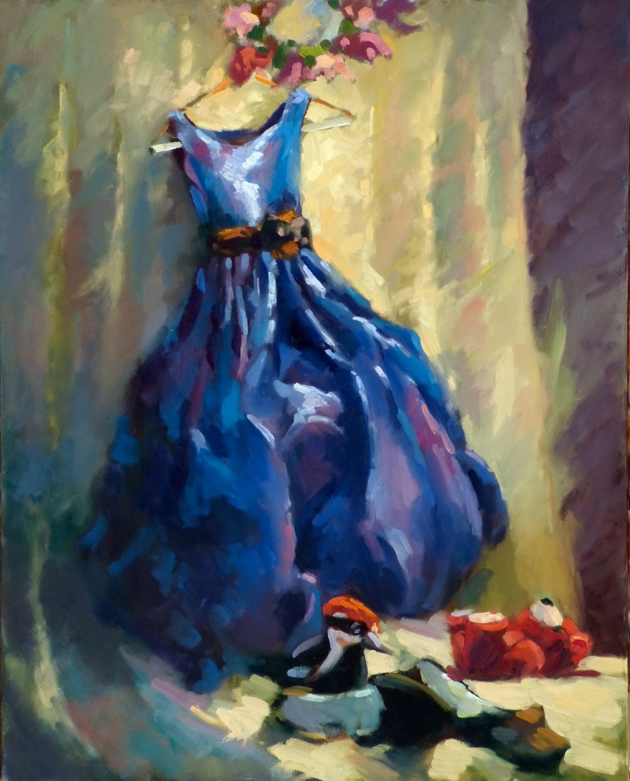
Changes, 24x30

Life Changes

A Young Girl Just Beginning Her Turn....

.....around the next corner of life, leaving behind the stuffed animals and toys....but never to forget them.  Toy Story all over again.  I should have named this 'Don't Go Changing' but, really, the change is nice to watch and we all wish them the best.  Ah, I'm getting nostalgic.

I thought it was portrait day at our small painting group so brought a large canvas.  If I had remembered it was still life day I would have brought a canvas formatted differently....but I think this worked out.

I had fun with this, although it was hard to compose and I think I'd try something different if I did it again.  At least this one alludes to a story.  Someone once told me that illustrations tell stories, paintings play with color and shape.  That doesn't make sense to me but there might be some element of truth there.

With that in mind I can't help think of Jamie Wyeth's painting of pumpkins with carved faces being thrown over the cliffs of the island he lives on.  It is both story and painting.....one that makes me laugh every time I see it.  There is something about the grotesque grinning faces cascading down that tickles me.

Maine painter Carol Douglas has an image of those freed pumpkins on her blog HERE.

How did I get off on all that?


Friday, November 14, 2014

Oksana, 10x12


Take a beautiful Russian model, throw in.....

......homemade potato soup, a glass of wine and excellent company.  All the makings of a delightful afternoon....and it was.

Since I had just driven back from Montana in some very cold weather and gotten back very tired late the night before I didn't plan on painting.   However, once I saw the cool lighting and backlit colors emanating from Oksana's face I couldn't resist.

Contre-jour lighting, meaning 'into the light', is hard on the eyes but great for color explorations.  Charles Reid does a lot of it, mostly in watercolor but also a few oils.  Shadows have a transparency about them allowing for transparent or semi-opaque color possibilities.  It feels like you can almost reach into them.

So I had some fun.

Come have some fun yourself in my Marker Workshop on Friday, November 21st.  Learn to draw in a different way using gray toned markers.  It is amazing how quickly you can make simple drawings come to life using these markers.  They are also great for planning out your next painting.

Join us.  We have a lot of fun!  Oksana might be there....    

Monday, November 3, 2014

Painting Pixies


Appeasing the Painting Pixies.....

Last Thursday I was talking with Pam Fermanis about a curious thing.  That's the day I get together with a small group of accomplished artists to paint portraits...and sometimes still life.

Pam was feeling that it was 'just one of those days' as nothing was really turning out for her.  Our conversation veered quickly to how one day can be so creatively different than even the day before.  Using the same paint, brushes, canvas and what-all, one day can be so successful that it almost feels like you could just walk away and let the tools finish the painting.  The next day, no matter how hard you try, or how mentally aware you are, nothing seems to work.

Same tools, same artist, similar subject....yet nothing works.  Sometimes it leaves me speechless....or swearing....or ready to quit painting for the 1,000th time.

Scientifically speaking, I've decided it's the Painting Pixies.  There is no other logical conclusion.  One day they like you and the next they don't care a whit.

While I felt for Pam, I was having a good day.  The PP's had blessed me with their magic.

The first painting I did was of my friend Francis and took about 2 1/2 hours to complete the 18x24 canvas.  He was in motion, making it fun to try and have it all work and still get a likeness.

Since I had almost an hour to go before we quit, I slapped on a 20x24 and did the still life in less than an hour.  See.  The Pixies were liking me that day.  I could have dozed off and it still would have worked out.


Two paintings in four hours.  I sure hope they don't expect anything in return.....


Thursday, October 30, 2014

Halloween Capitol, Anoka


I Come From the Halloween Capitol.....

..... of the World.  That's World.  Not just town, county, state, country or regional area.  The whole bloomin' world.  Our town is proud.  I'm surprised it wasn't the universe.  Being Minnesotan I guess we have limits on 'proud'.

Every year the school kids....do they still do this?....dress up in elaborate costumes and parade through the town.  One year my brother and I were two 22 foot white worms made from coils of wire and bedsheets.  Another we were robots....silver cardboard from head to toe.  Our parents were creative.

It was/is also the day of the Pumpkin Bowl where football was/is played with devotion, vigor and in protection of our sacred Halloween rights.  My sister collects memorabilia of Halloween's past from our innocent little town.  I haven't been back in years but without a doubt it hasn't changed much. 

So, every year I do my tribute with a painting or a drawing about the hallowed day.  Here are two from our island pumpkin patch.


Sunday, October 26, 2014

She Wore Her Party Dress, 11x14


She Almost Broke Her Face.

Sitting on the edge of a couch, her hands on the edge of the cushions to prop herself up, head canted and turned to one side and Smiling for several hours.....I was waiting for her face to develop fissures.  In all the time I have done portraits there has never been a model who could broadly smile and keep the same exact pose for hours without even a whimper.  Her name is Kathy.  Super Model.

So it seems I'm on another of my 'kicks' that I periodically go through.  This one is about painting using just three primary colors.  I think I'm trying to get a sense of color compatibility and possibility.  Cad Lemon, Cad Red Medium and Ultramarine Blue in this one.

Most three pigment painters I have seen end up with paintings that are somewhat gray, lacking in vibrancy, in my opinion.  I was looking through my library the other day and pulled out one of Kevin McPherson's books in which he talks about the three or four pigment palette.  His paintings weren't gray.  Zorn's paintings, using an even more limited palette, aren't gray.

So I'm giving the whole thing another look and working on my color vocabulary.         

Thursday, October 23, 2014

Back Street Montisi, 11x14


Rain, Sun, Clouds, Wind....

.....It was an afternoon that provided everything.  Marianne and I had wandered around our Italian town looking for an interesting place to paint that was a little protected.  This alley was IT.

I liked the way this little road disappeared around the corner and how a 'local' would suddenly appear, obviously taking the 'short cut'.  They weren't sure what to make of us but they were all friendly.

Since painting all those weather conditions wasn't going to work I had to pick one so whenever the sun peaked out I memorized the light pattern.  It is all just shapes and bit of color but I like how it all goes together.

Every town in Tuscany has it's own charm....and we will be going back in 2015.

Marianne painted that little door peaking out on the right.  I'm going to bug her to get it posted.  It was a nice painting.   


Monday, October 20, 2014

Running Into Fall, 14x18


It was an experiment.

I got some unexpected energy last week.....pneumonia recovery is unpredictable....so I wondered what would happen if I painted a piece using only three colors.

There was an old plein air work hanging around that was done on a Montana autumn afternoon while deep in the forest.  It seemed a likely candidate to be put to the test.

In the Tuesday painting class I've been talking about using three primaries (red, blue, yellow), or colors close to primary, as a way to expand color mixing vocabulary.   On pieces I've done before like this the results have been intriguing.   For example, I like to paint in acrylic outdoors using only Thalo blue, Cadmium Yellow and Burnt Sienna.

Below is the original plein air sketch.  I've modified the scale, format and paint application to do the larger piece and I like the result.  Being a bit wider I think it better represents the sense of flow and the bottleneck caused by those two large boulders.

What colors?  Ultramarine Blue, Cadmium Red Medium and Quinacridone Gold. 


Sunday, October 19, 2014

Afternoon Sketch, 11x14


There was just enough time....

....to squeeze in an afternoon painting if I worked fast.  Standing in the garden of the villa I could look out over the hills and fields and even see the next town in the distance.  I didn't know Italy was mountainous and I found it a pleasant surprise to be able to include that peak in the distance.

Simplifying all the fields, trees, shapes and colors was a challenge especially with the in and out changing light.  Like I said, a quick sketch.  It was equally hard to get it to adjust on the computer screen accurately....or at least almost so.

I'm looking forward to another attempt next year.


Tuesday, October 14, 2014

Montisi Nocturne, 11x14


The meals at the villa in Montisi were.......

.....incredibly good.  Thinking I needed a walk before tackling the endless courses of food, I decided to take a short walk.  About a block away I ran into this glowing tower and got a little feverish with a painting attack.

I waited a polite amount of time before bolting from the dinner table and heading back with my paint kit.  The streets are narrow so the only place to stand was on a darkened corner at the top of a stairway....well, my easel was at the top.  I was on the first two steps down looking over the edge of my palette and reaching up to apply paint.  

There was very little light.  I had to remember where the colors were on the palette and mix them as best I could.  What could I actually see on my panel?  Here is an idea.


Really.  Occasionally I could run down the stairs so there was more light on the panel but this was what it looked like most of the time.  The car and background were complete mysteries.

When I got back I was pleasantly surprised by the result.  With very little doctoring up this was what I got.  Reminds me of a couple pieces I did in Mexico in similar circumstances that turned out well also.  Wonder if I should always paint in the dark.....?


Thursday, October 9, 2014

A Villa Garden, 8x10


'Off the grid' have I been....

.....due to a dance with pneumonia.  I wouldn't recommend it.....but I'm almost 'normal', whatever that means....but  I guess it means I'm interested in painting again.

Anyway, this was the first demo painting I did at the Italy workshop  (plans are afoot already for another next year).  Wanting to do something relatively simple I decided on this.  OK.  To be honest it was the most comfortable seating area in the garden and THEN I decided what I could see to paint.

I taped a loose piece of linen to a board, toned it with some burnt sienna and talked my way through the stages.  It's a quick little piece but I like the way the colors came together.

Here is a pic one of the other painters posted on Facebook about a week ago.  I'm taking the tape off just prior to final touch-up....can't judge it as well with all that blue tape so the refinement takes place with it off.


By the way, my Fall 2014 painting classes begin this next Tuesday from 9:30 to 1:30 followed by open studio time.  Open to oil, acrylic, gouache, casein or pastel.  There are a couple of spots still available if you can make it.